The Definitive Guide to Web Design Aesthetics: 35+ Design Trends Explained
1.
Neobrutalism / Neo-Brutalism
Also Known As: Brutalist Web Design, Raw Design, Anti-UX Design
Overview
Neobrutalism is web design's punk rock. It rejects polish, refinement, and conventional "good taste" in favor of raw, confrontational aesthetics. Named after Brutalist architecture (béton brut = raw concrete), it embraces harsh contrasts, visible construction, and deliberate awkwardness.
Key Visual Characteristics
High-contrast color palettes: Often black and white, or stark primaries against neutrals
Bold, thick borders: 2-5px black strokes on everything
No subtle shadows: Shadows are hard-edged or absent entirely
System fonts or monospace: Courier, Monaco, or browser defaults
Raw HTML aesthetic: Tables, default form elements, minimal CSS
Visible grid structures: Content doesn't hide its containment
Unconventional navigation: Links might just be underlined text
No stock photos: Illustrations, screenshots, or no images at all
When It Emerged / Peaked
Emerged around 2014-2016 in reaction to overly polished web design. Peaked in 2018-2020 but continues to influence contemporary design, particularly in tech, creative, and countercultural spaces.
Best Use Cases
Creative agencies wanting to signal boldness
Tech startups differentiating from "corporate" competitors
Portfolio sites for designers/developers
Cultural institutions and independent publishers
Brands targeting young, design-savvy audiences
Any project where "we're not like other companies" is the message
Example Websites
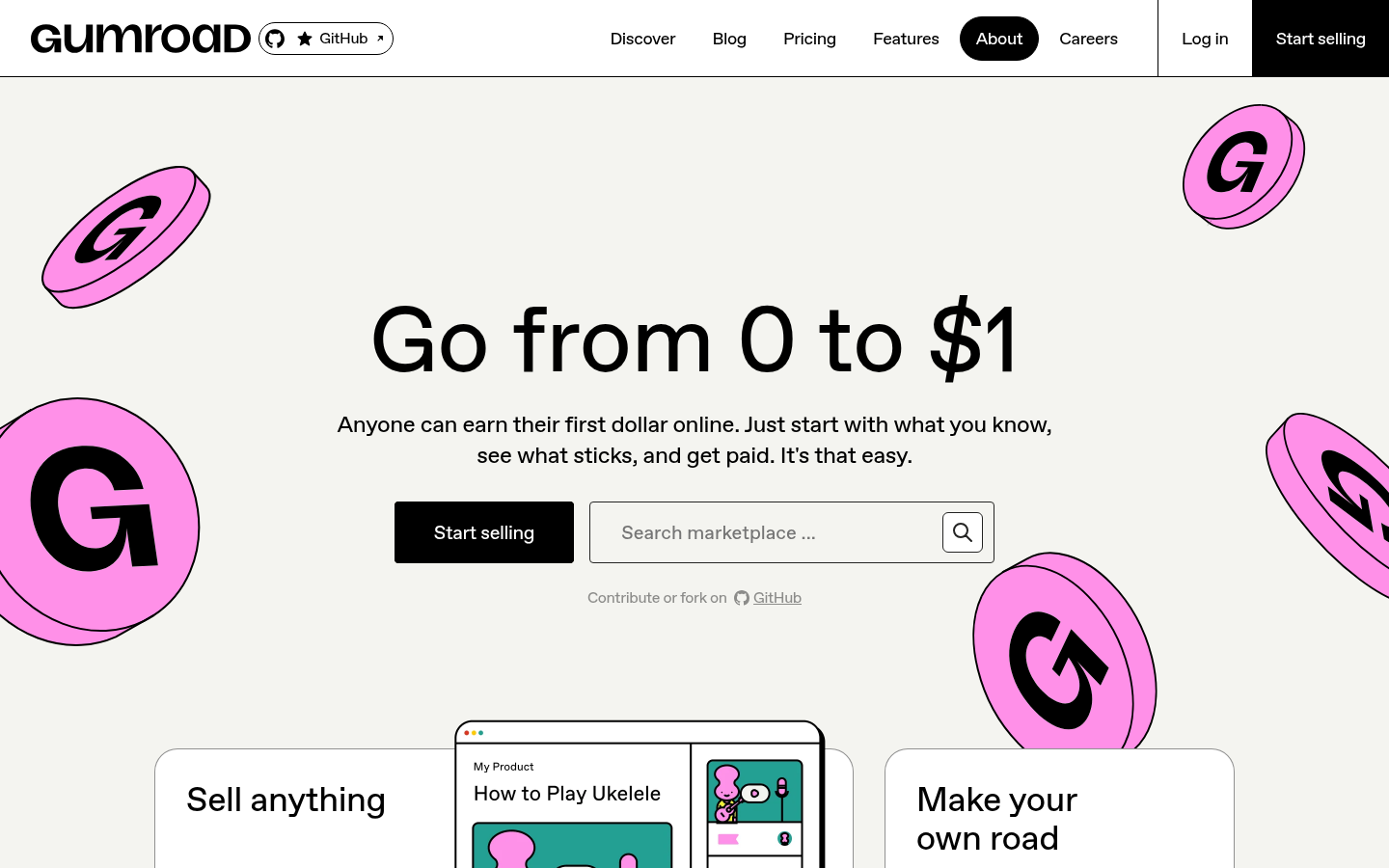
Gumroad NeobrutalismGumroad (gumroad.com) — Creator economy platform with harsh pink accents, thick black borders, and raw typography.
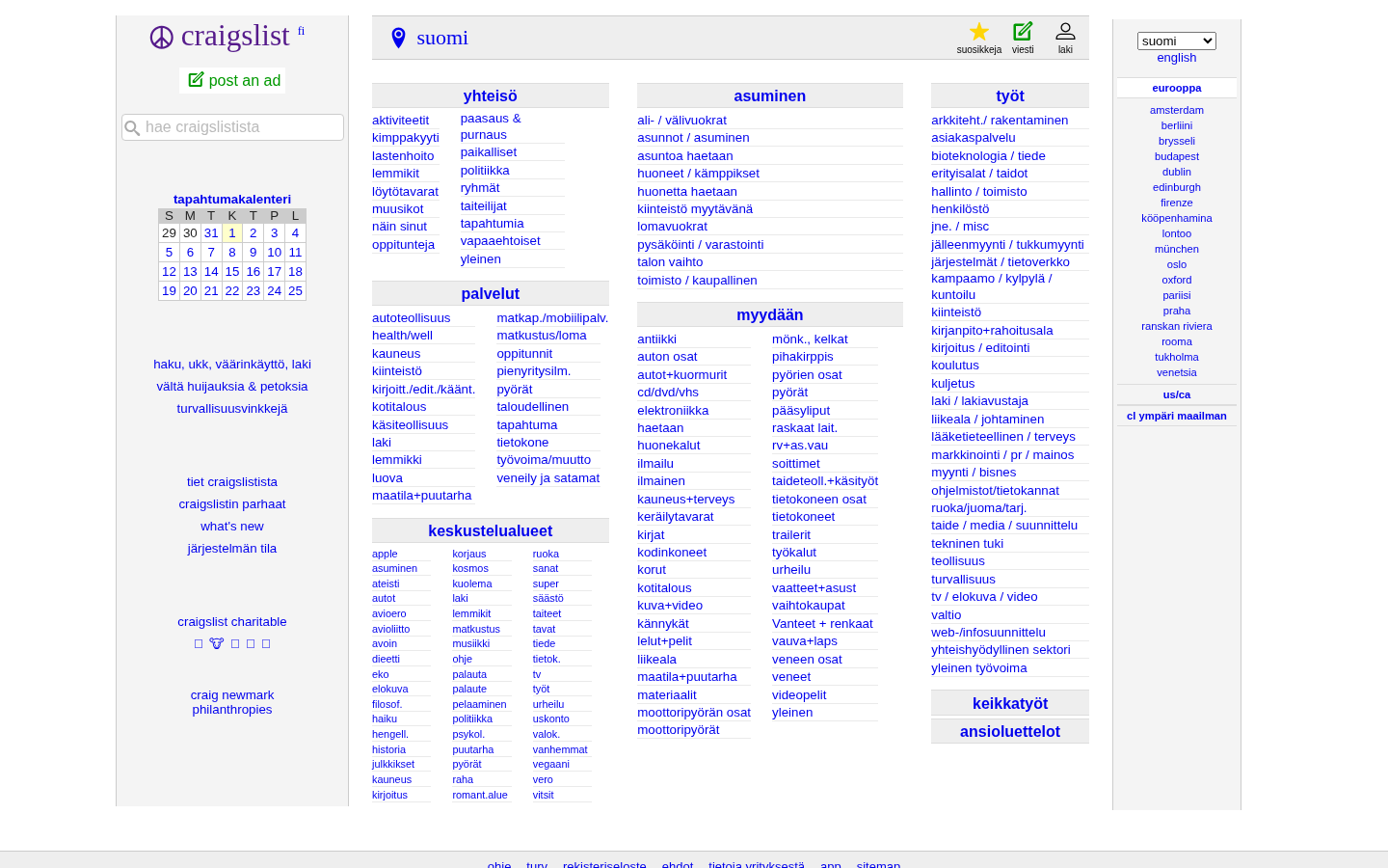
CraigslistCraigslist (craigslist.org) — The accidental brutalist, unchanged aesthetic now iconic.
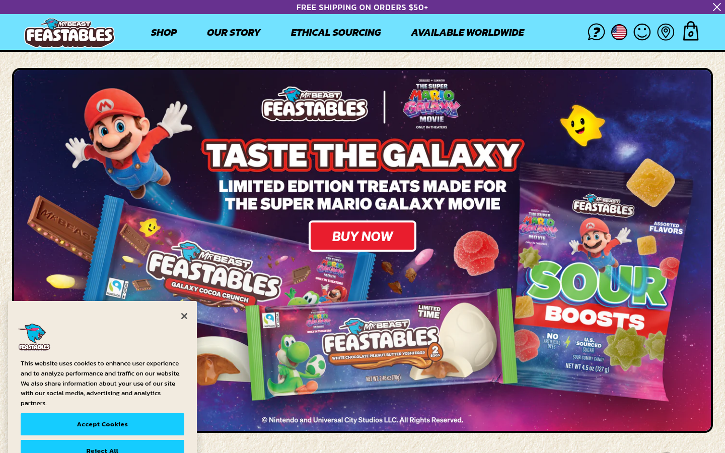
FeastablesFeastables (feastables.com) — MrBeast's chocolate brand with bold colors, thick borders, chunky typography.
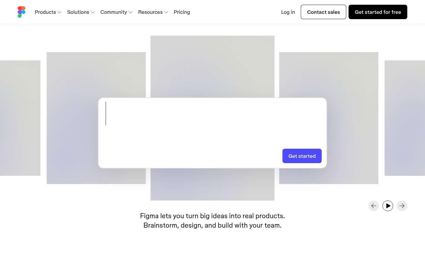
Figma NeobrutalismFigma (figma.com) — Bold contrasts, unconventional typography, high-contrast color blocks.
Also Known As: Frosted Glass UI, Glass Morphism, Blur UI
Overview
Glassmorphism creates the illusion of frosted glass panels floating over colorful backgrounds. It combines translucency, blur effects, and subtle borders to create depth while maintaining a clean, modern aesthetic. Apple's macOS Big Sur (2020) brought this style into mainstream consciousness.
Minimalist content: Glass works best with simple content
Gradient overlays: Subtle gradient tints on glass
High contrast icons/text: Content must be readable against varying backgrounds
When It Emerged / Peaked
Emerged around 2020 with macOS Big Sur. Peaked in 2021-2022. Remains popular but use has become more selective as designers learn its accessibility challenges.
Best Use Cases
Dashboard UIs with colorful data visualizations
Music/media players
Mobile apps with photo backgrounds
Landing pages with hero images
Login/modal overlays
Dark mode interfaces
Creative/design tool interfaces
Example Websites
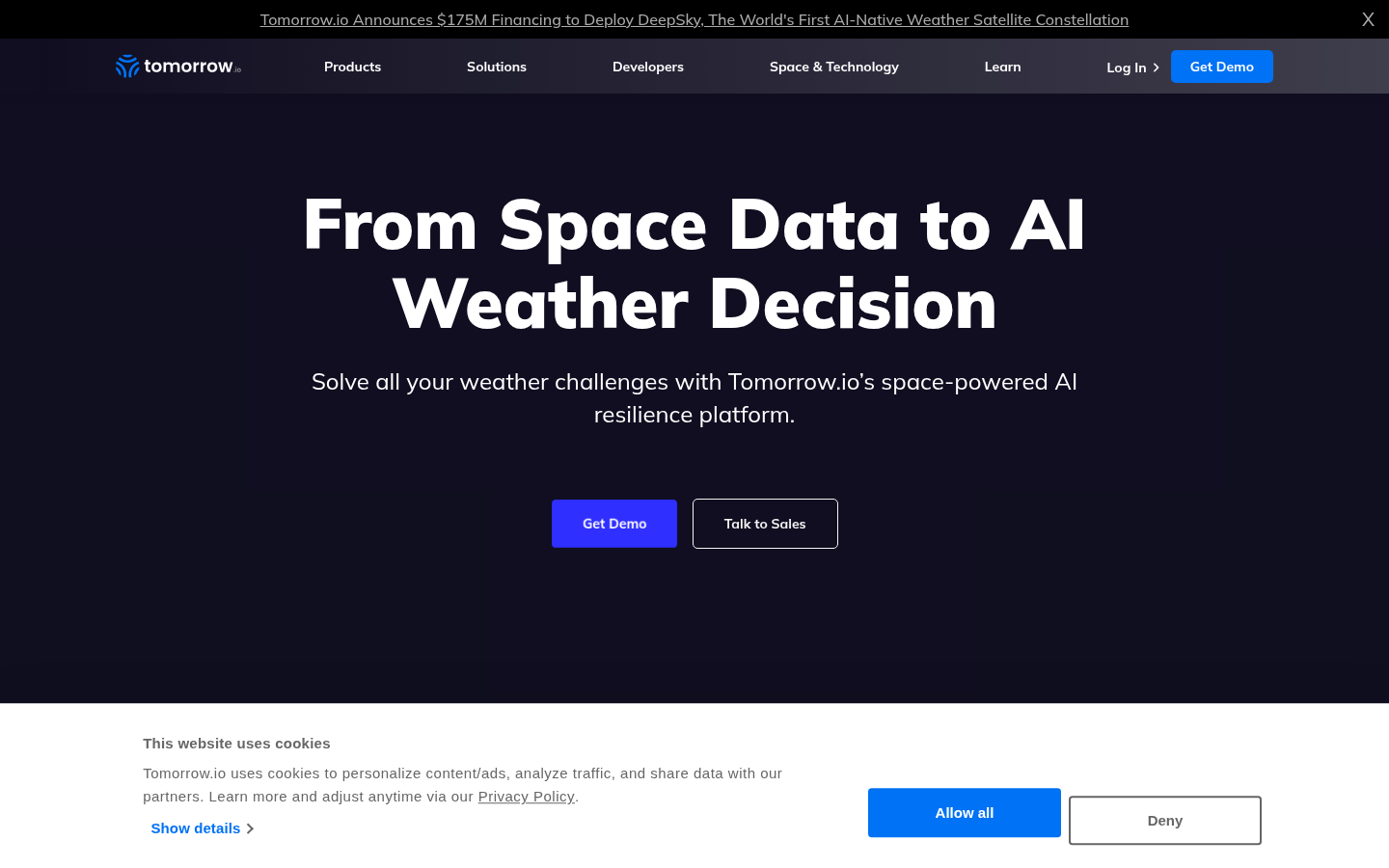
Tomorrow.io GlassmorphismTomorrow.io (tomorrow.io) — Weather platform with frosted glass cards over colorful backgrounds.
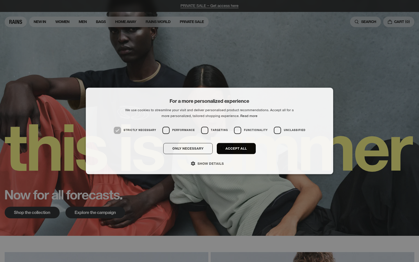
Rains GlassmorphismRains (rains.com) — Danish outerwear brand using frosted glass navigation over large background images.
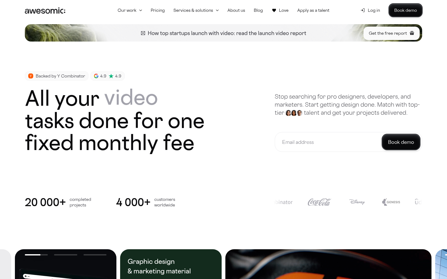
Awesomic GlassmorphismAwesomic (awesomic.com) — Design service with translucent, blurred glass panels over gradient backgrounds.
Glassmorphism can create readability issues. Always ensure sufficient contrast between text and varying background colors. Test with different background images.
3.
Neumorphism / Soft UI
Also Known As: Soft UI, Neo-skeuomorphism, Plastic UI
Overview
Neumorphism creates the illusion of elements extruding from or pressing into the background, as if carved from a single piece of soft material. It uses careful shadow manipulation to simulate physical depth while maintaining a clean, minimal look.
Key Visual Characteristics
Monochromatic color schemes: Background and elements share the same hue
Dual shadows: Light shadow on one side, dark on the opposite
Extruded elements: Buttons and cards appear to push out
Inset/pressed states: Elements can also appear pressed in
Soft, diffused edges: No hard borders
Minimal color use: Usually single-color with tonal variations
Emerged late 2019, popularized by dribbble concepts. Peaked 2020. Use declined due to accessibility concerns (low contrast), but still appears in specific contexts like music players and IoT controls.
Best Use Cases
Music/audio player interfaces
Smart home/IoT controls
Calculator and simple tool apps
Settings panels
Accent elements (not full-page designs)
Physical product companion apps
Meditation/wellness apps
Example Websites
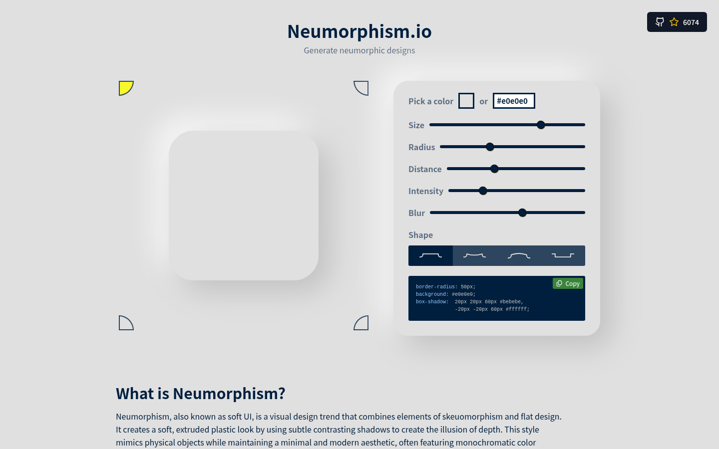
Neumorphism.ioNeumorphism.io (neumorphism.io) — The canonical soft-UI CSS generator, fully neumorphic design.
Skeuomorph.ioSkeuomorph.io (skeuomorph.io) — Neumorphism CSS generator and showcase.
Neumorphism has significant accessibility issues. The low contrast between elements makes it difficult for users with visual impairments. Avoid for primary navigation, form inputs, or any critical UI elements.
4.
Minimalism
Also Known As: Clean Design, White Space Design, Less Is More
Overview
Minimalism is the discipline of reduction. It strips interfaces to their essential elements, relying on white space, typography, and careful composition to create elegant, focused experiences. Rather than a trend, it's a design philosophy that has remained relevant for decades.
Key Visual Characteristics
Abundant white space: Generous margins and padding
Limited color palette: Often monochrome with one accent
Typography-focused: Large, well-set type carries the design
Grid-based layouts: Clean, predictable structure
Minimal navigation: Hidden menus, simple nav bars
No decorative elements: Every element serves a purpose
High-quality imagery: When images appear, they're impactful
Sans-serif fonts: Clean, geometric typefaces
Subtle interactions: Hover states are gentle, not flashy
As a web aesthetic, minimalism emerged with iOS 7 (2013) and continues today. It's less a "trend" that peaks and more a foundational approach that other trends react to or incorporate.
Best Use Cases
Luxury brands
Professional services (law, finance, consulting)
Portfolio websites
E-commerce (especially high-end)
Corporate/enterprise
SaaS landing pages
Editorial/publishing
Photography showcases
Example Websites
Google MinimalismGoogle (google.com) — The most minimal product page on the web.
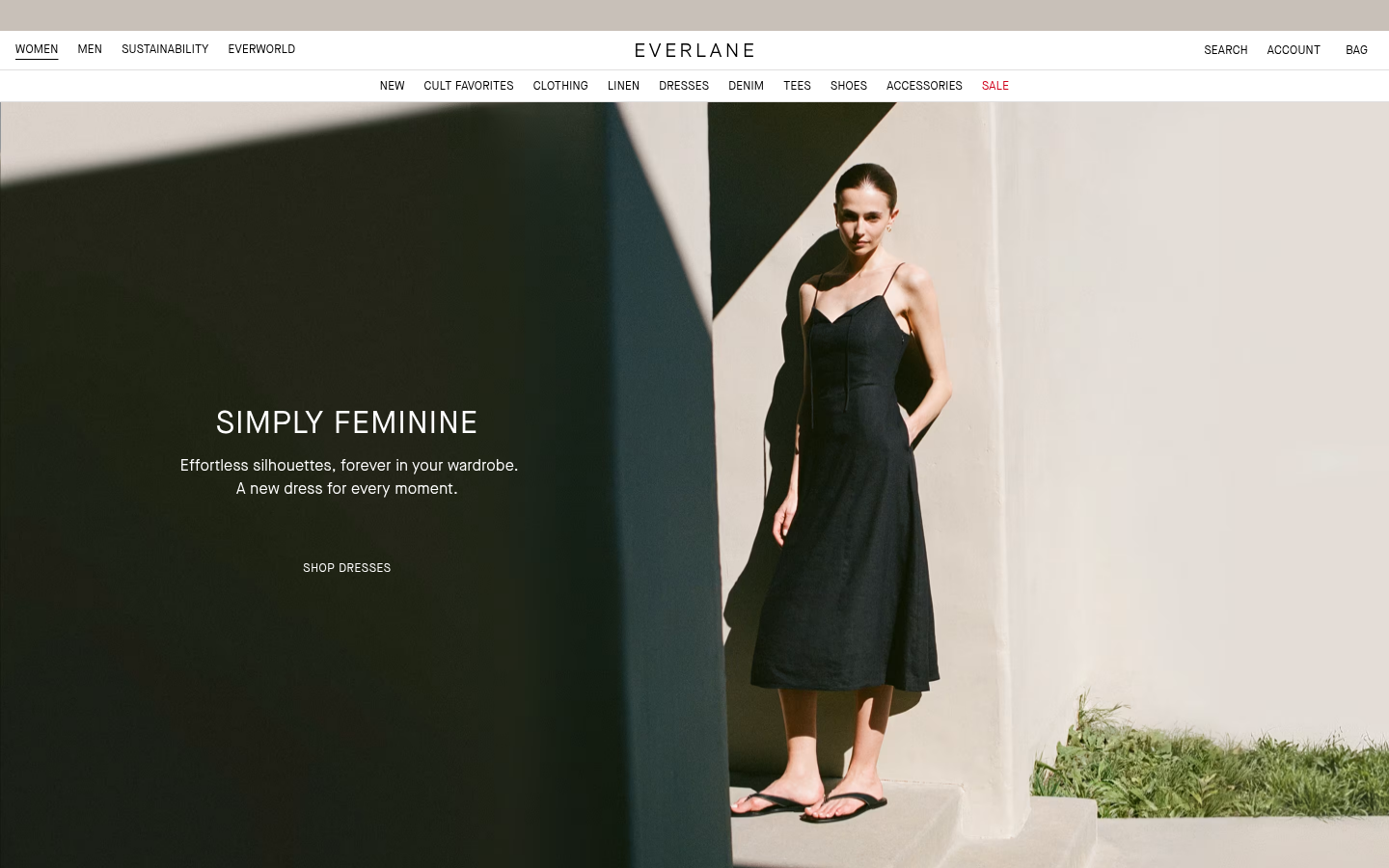
Everlane MinimalismEverlane (everlane.com) — Clean e-commerce with neutral tones and product-focused imagery.
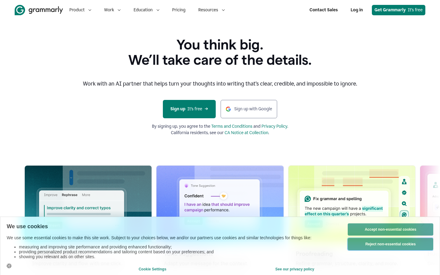
Grammarly MinimalismGrammarly (grammarly.com) — Soft green-and-white scheme with ample whitespace.
Design Within ReachDesign Within Reach (dwr.com) — Furniture site with grid-based layout presenting products like museum pieces.
Also Known As: More Is More, Anti-Minimalism, Eclectic Design
Overview
Maximalism rejects minimalist restraint in favor of abundance, complexity, and visual richness. It layers patterns, colors, textures, and elements to create immersive, sensory-rich experiences. When done well, it's exuberant and memorable; done poorly, it's overwhelming.
As a reaction to minimalism, maximalism has always existed in design. In web design specifically, it resurged around 2018-2020 and continues as a counterbalance to minimal trends.
Also Known As: International Style, Swiss Style, Grid Design
Overview
Originating in 1950s Switzerland, this style emphasizes readability, objectivity, and systematic design. It's the foundation of modern graphic design and remains influential in web design, particularly for brands wanting to communicate precision and reliability.
Photography over illustration: Objective, documentary imagery
Flush left, ragged right text: Clean text alignment
White space as element: Deliberate use of emptiness
Limited colors: Often black, white, and one accent
Information hierarchy: Clear visual ordering
Geometric shapes: Circles, lines as dividers
No ornamentation: Pure functional design
When It Emerged / Peaked
Original movement: 1950s-1960s. In web design, it influences contemporary minimalism and has never truly "peaked" — it's foundational.
Best Use Cases
Corporate identity
Financial services
Architecture and engineering firms
Academic institutions
Government and public services
B2B software
Editorial and publishing
Museum and gallery sites
Example Websites
IKEA Swiss DesignIKEA (ikea.com) — Clear bold sans-serif fonts, grid-based catalog, strong visual hierarchy.
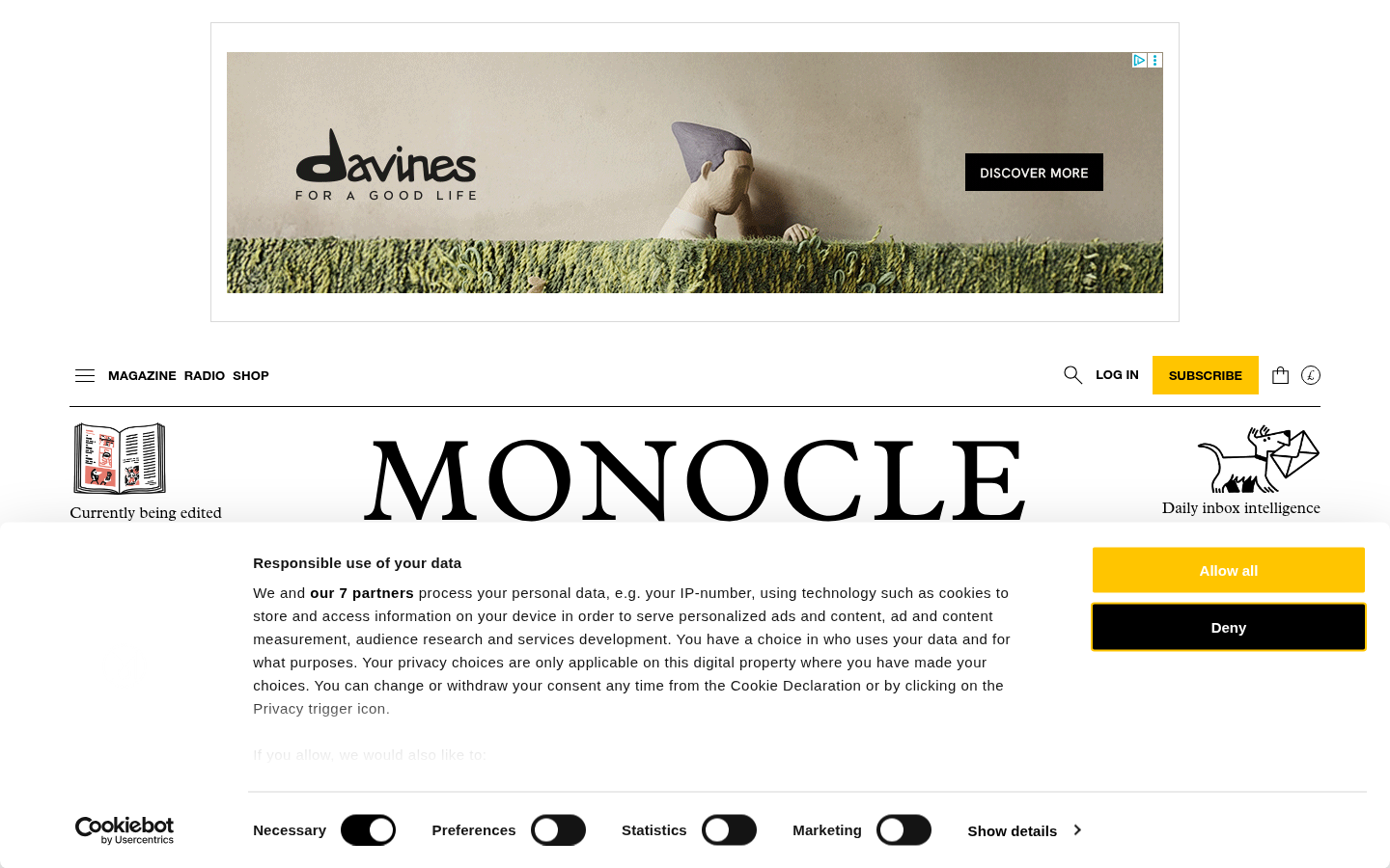
Monocle Swiss DesignMonocle (monocle.com) — Magazine with strict grid structure and Helvetica-style typography.
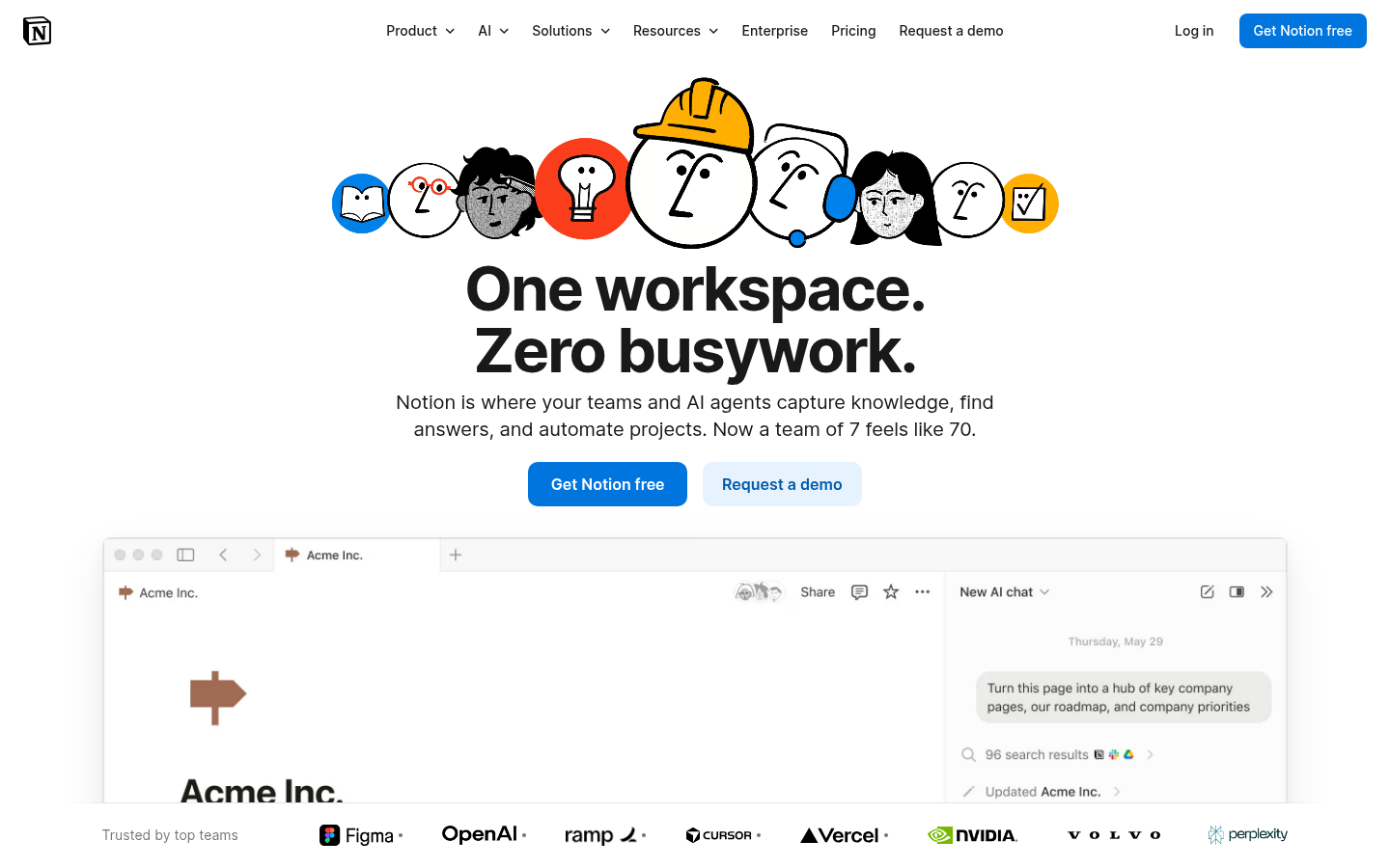
Notion Swiss DesignNotion (notion.so) — Block-based system built on grid principles with clean sans-serif type.
7.
Material Design
Also Known As: Material, Google Design, Paper UI
Overview
Created by Google in 2014, Material Design is a comprehensive design system that uses physical metaphors—particularly paper and ink—to create intuitive interfaces. It adds subtle depth to flat design through systematic use of shadow, motion, and color.
Responsive patterns: Defined breakpoints and behaviors
When It Emerged / Peaked
Launched 2014. Peaked 2015-2017. Material Design 2 (2018) and 3 (2021) evolved the system. Remains the default for Android apps and many web applications.
Best Use Cases
Android applications
Google products and services
Enterprise software
Productivity tools
Educational platforms
Any product needing a comprehensive design system
Applications where consistency trumps uniqueness
Example Websites
YouTube Material DesignYouTube (youtube.com) — Material Design at massive scale.
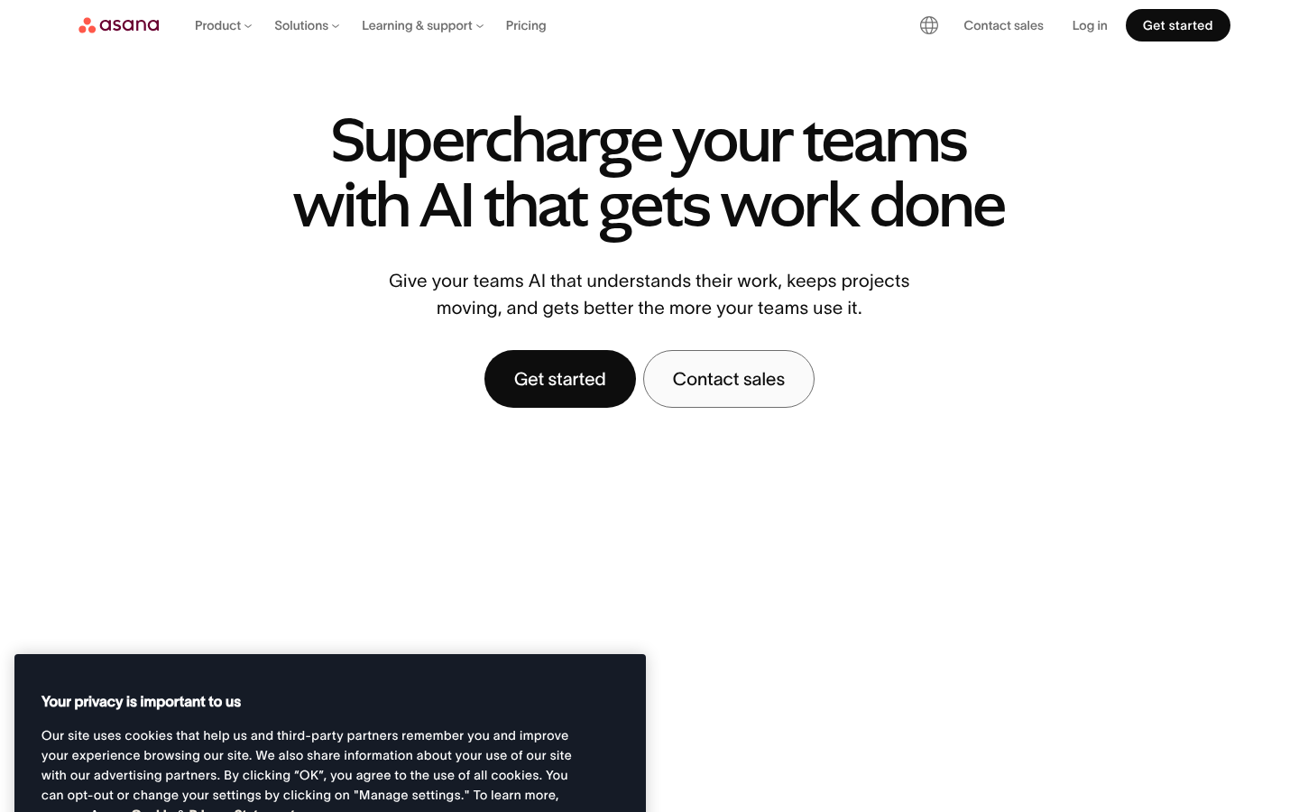
Asana Material DesignAsana (asana.com) — Material-influenced productivity design.
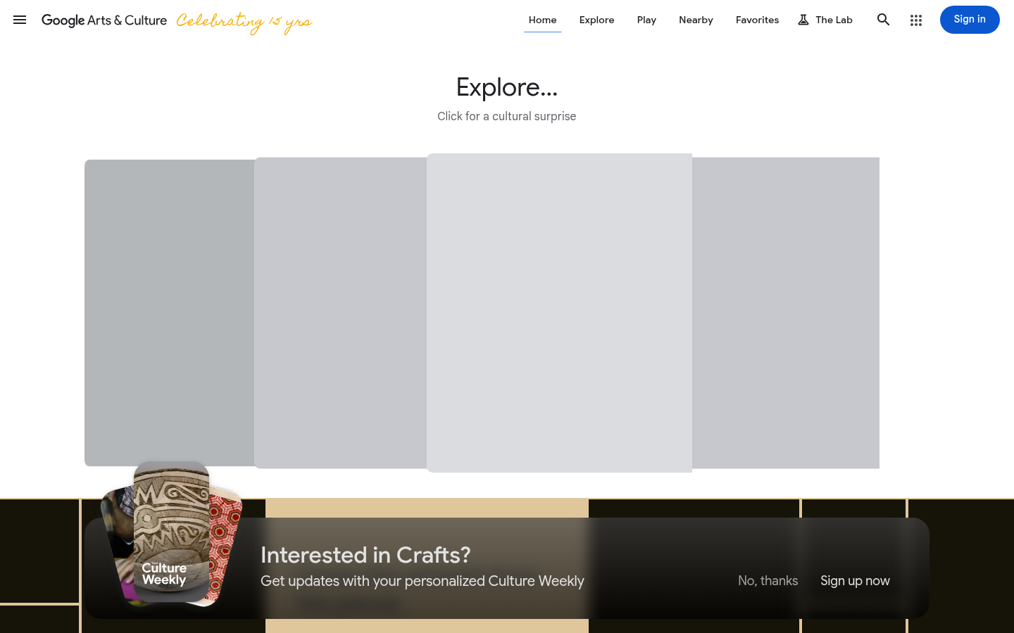
Google Arts & CultureGoogle Arts & Culture (artsandculture.google.com) — Material Design cards, elevation, and ripple effects.
8.
Flat Design
Also Known As: Flat UI, Metro (Microsoft), Flat 2.0
Overview
Flat design strips away all three-dimensional effects—gradients, shadows, textures—in favor of simple, two-dimensional elements. It emerged as a reaction to skeuomorphism's visual excess and became the dominant paradigm of the 2010s.
No gradients: (though Flat 2.0 reintroduced subtle ones)
Minimalist photography: Simple, clean imagery
Focus on content: UI gets out of the way
When It Emerged / Peaked
Microsoft's Metro (2010), Windows 8 (2012), iOS 7 (2013). Peaked 2013-2016. Evolved into "Flat 2.0" and influenced all subsequent trends.
Best Use Cases
Mobile apps
Dashboard interfaces
Icon sets
Infographics
Startup landing pages
E-commerce
News and content sites
Any digital product prioritizing performance
Example Websites
Namada Flat DesignNamada (namada.net) — Clean flat shapes, bright solid colors, zero shadows or gradients.
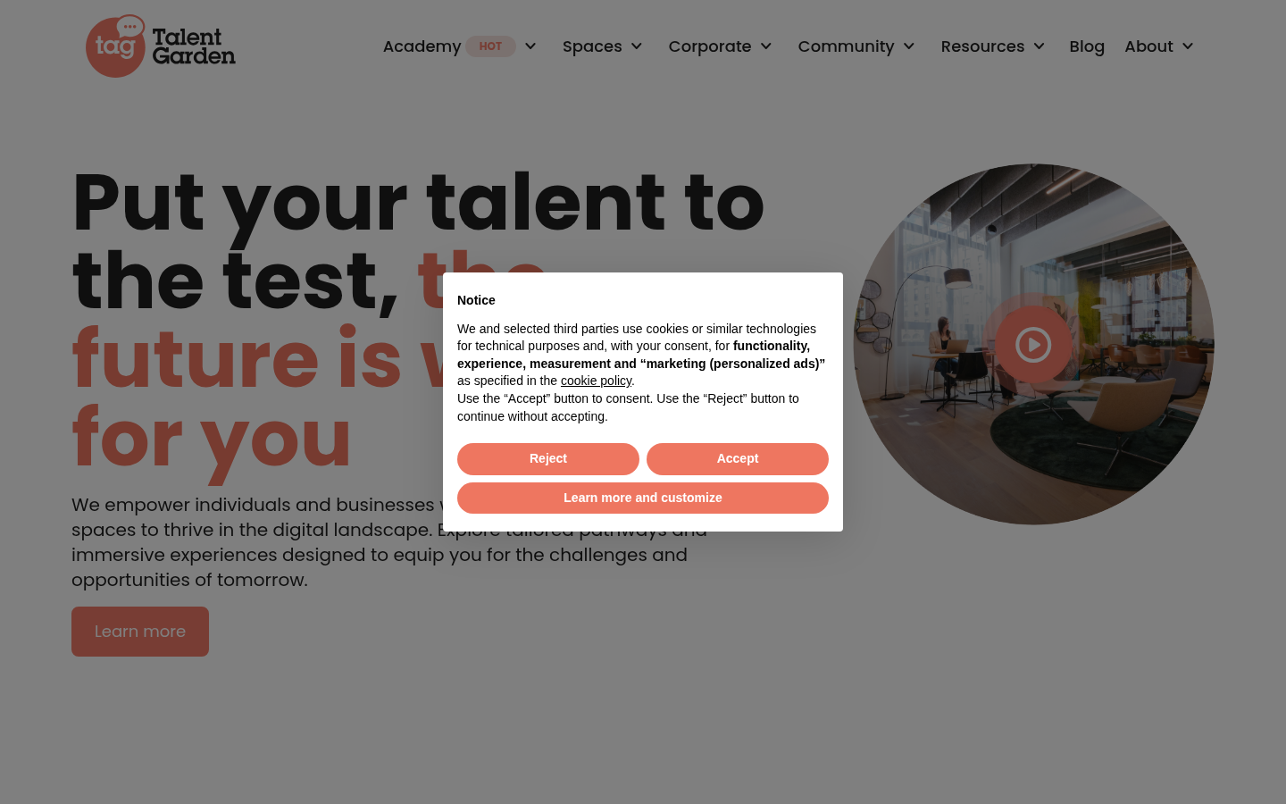
Talent Garden Flat DesignTalent Garden (talentgarden.com) — Flat color blocks, simple geometric shapes, no depth effects.
9.
Skeuomorphism
Also Known As: Realistic UI, Rich Design, Pre-Flat Era
Overview
Skeuomorphism mimics real-world materials and objects in digital interfaces. Leather textures, paper effects, wood grain, metal knobs—all designed to make digital experiences feel familiar and tactile. While once dominant, it now exists as a nostalgic or intentional choice.
Dominated 2007-2012, particularly through Apple's iOS and Mac apps. Died with iOS 7 but occasionally returns for nostalgic or deliberate effect.
Best Use Cases
Nostalgic/retro projects
Music software (DAWs, synthesizers)
Games and entertainment
Niche tools mimicking physical counterparts
Children's educational apps
Luxury/craft brands emphasizing craftsmanship
Example Websites
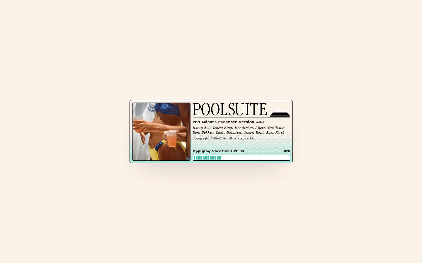
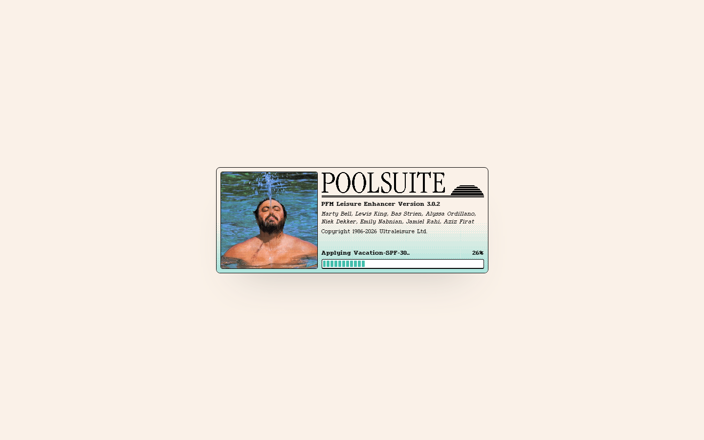
Poolside.fm SkeuomorphismPoolside.fm (poolside.fm) — Deliberate retro skeuomorphism with old Mac aesthetic.
Poolsuite SkeuomorphismPoolsuite (poolsuite.net) — Retro Mac OS desktop interface with draggable windows.
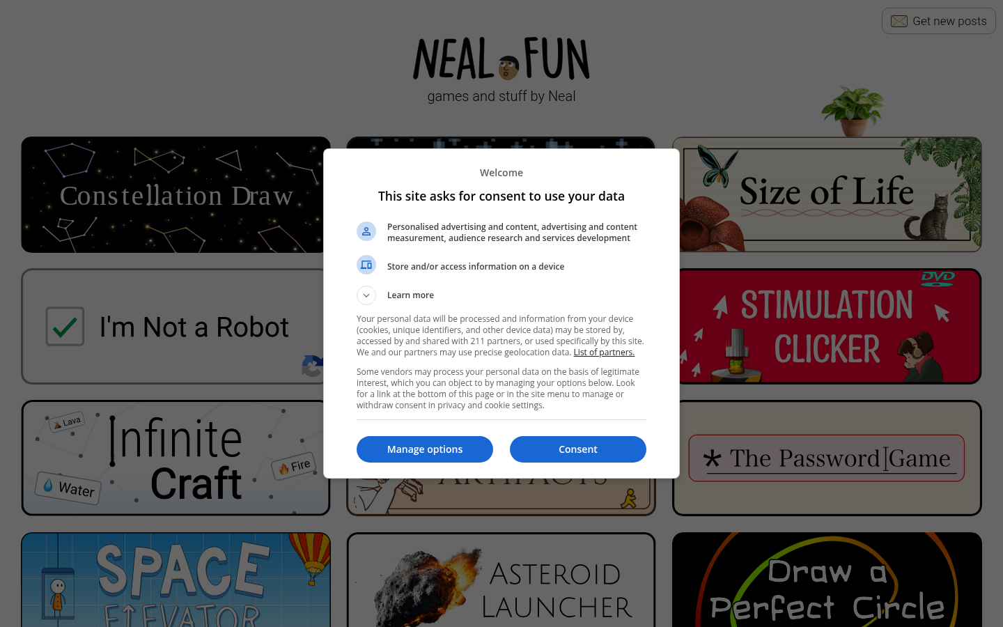
Neal.fun SkeuomorphismNeal.fun (neal.fun) — Interactive elements mimicking real-world objects with nostalgic textures.
10.
Dark Mode / Dark UI
Also Known As: Night Mode, Dark Theme, OLED-Friendly Design
Overview
Dark mode inverts the traditional light-background paradigm, using dark backgrounds with light text. Beyond aesthetic preference, it reduces eye strain in low light, saves battery on OLED screens, and can make other design elements (like photos or colorful UI) pop.
Key Visual Characteristics
Dark backgrounds: Near-black (#121212) or dark grays
Light text: White or light gray (#E0E0E0)
Reduced contrast: Not pure black/white (easier on eyes)
Colored accents: Vibrant colors stand out more
Depth through tone: Lighter grays for elevated surfaces
Careful image treatment: Images may need adjustment
Glowing effects: Neons and highlights work well
Subtle shadows: Dark-on-dark shadows for depth
System integration: Respects OS-level dark mode preference
Consistent dark: Entire experience is dark, not mixed
When It Emerged / Peaked
Always existed in specialized contexts (IDEs, media apps). Mainstream explosion 2018-2020 with iOS/Android dark mode support. Now a standard expectation rather than a trend.
Best Use Cases
Media/entertainment apps
Development tools and IDEs
Night-use applications
Photography/video editing
Gaming interfaces
Streaming services
Any app used in low-light conditions
Premium/luxury positioning
Example Websites
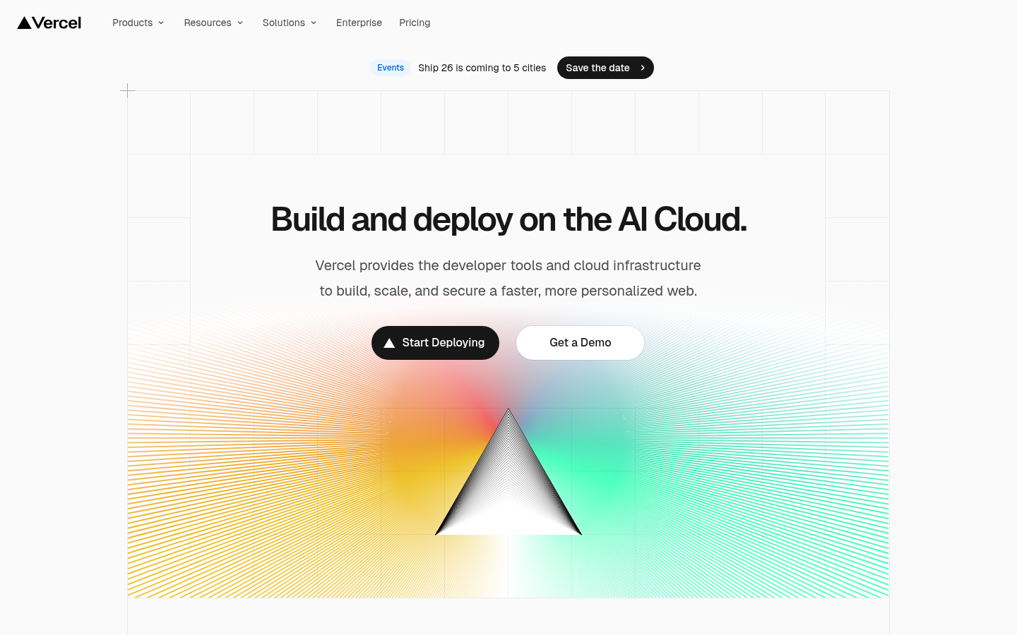
Vercel Dark ModeVercel (vercel.com) — Minimal dark-first UI with subtle animations on black background.
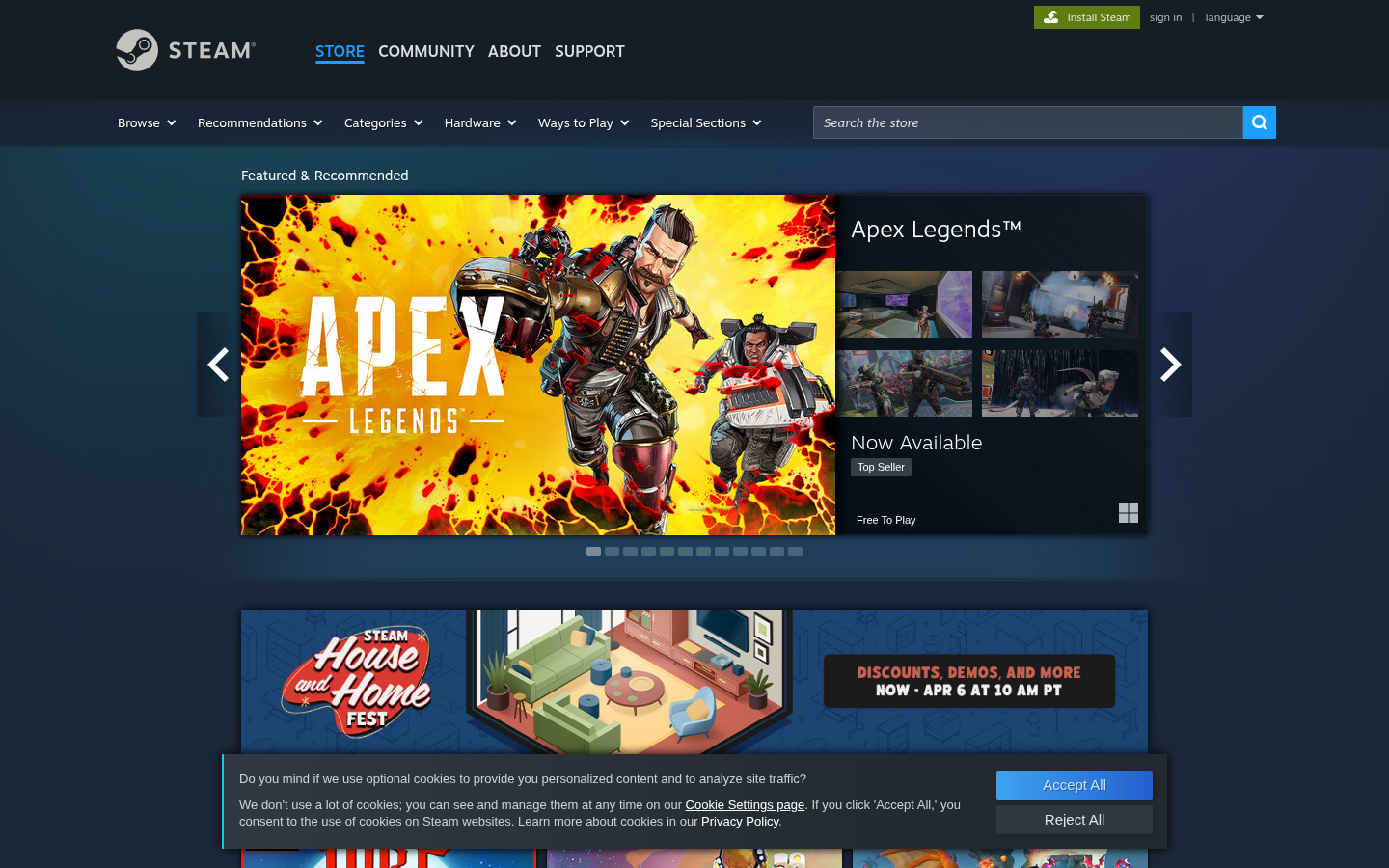
Steam Dark ModeSteam (store.steampowered.com) — Default dark theme with deep blues and grays.
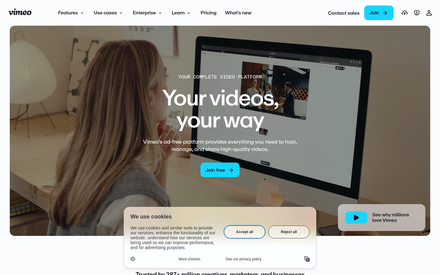
Vimeo Dark ModeVimeo (vimeo.com) — Dark-first video platform with accent color highlights.
Also Known As: Gradient Design, Aurora Backgrounds, Color Transitions
Overview
Gradients create smooth transitions between colors, adding depth and visual interest without the complexity of images. Modern gradients go beyond simple linear/radial to include mesh gradients (multiple color points blending organically) and animated color transitions.
Key Visual Characteristics
Multi-color blends: Three or more colors transitioning
Subtle transitions: Gentle, almost imperceptible blends
Bold transitions: Dramatic color shifts
Animated gradients: Colors shifting over time
Grain texture overlay: Added noise for tactile quality
Gradient text: Headlines with gradient fills
Glass effects: Gradients behind glassmorphism
Brand colors: Gradients using brand palette
When It Emerged / Peaked
Web 2.0 (2005-2010) had initial gradient craze. Flat design killed them. They returned c. 2017 with Instagram's rebrand and peaked 2019-2022. Mesh gradients specifically surged 2020-2023.
Best Use Cases
Hero sections and backgrounds
Brand identity expression
Tech/software marketing
Social media aesthetics
Music and entertainment
App icons and logos
Email headers
Presentation backgrounds
Example Websites
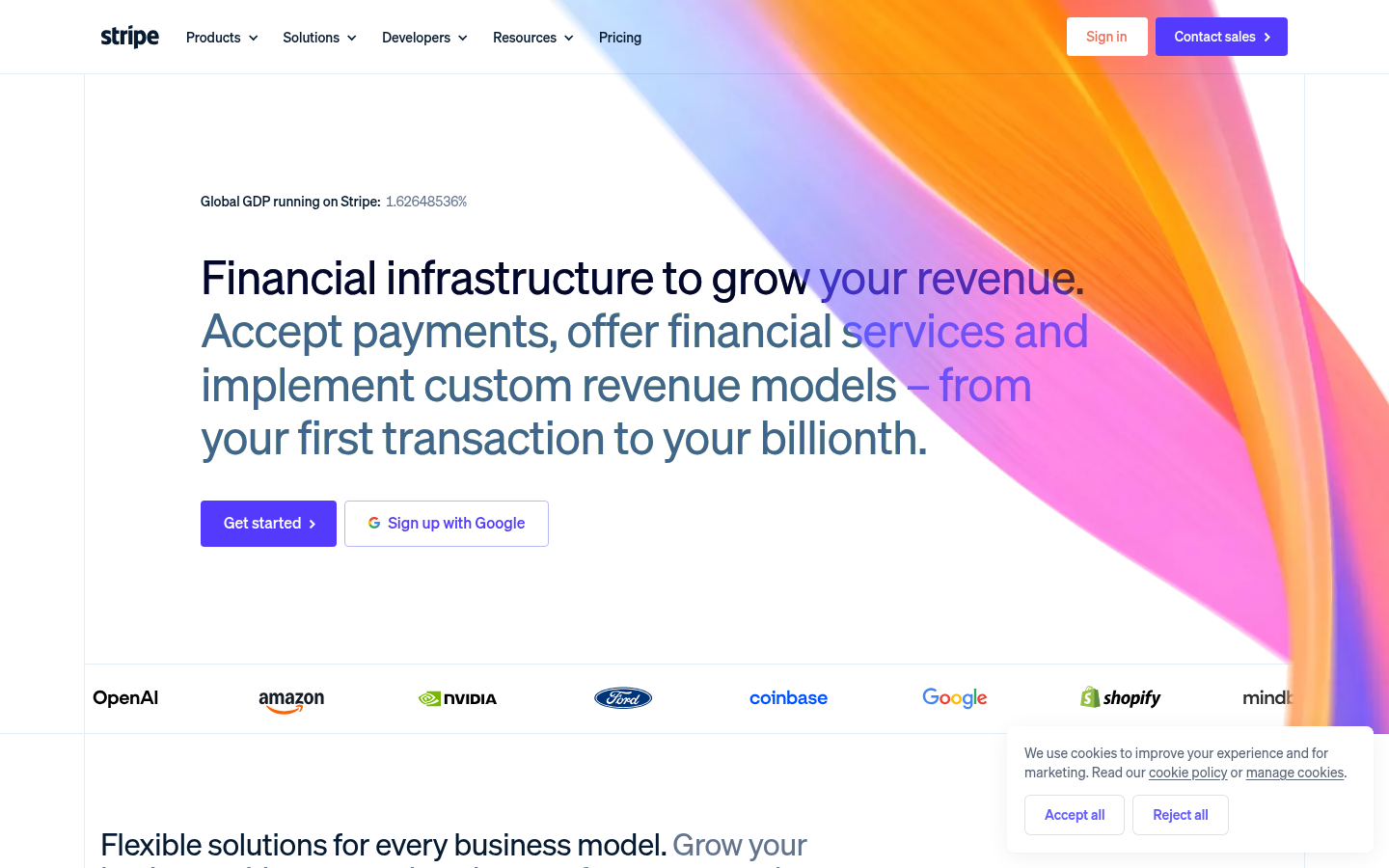
Stripe GradientsStripe (stripe.com) — Masters of animated gradient hero with blue, pink, purple blending dynamically.
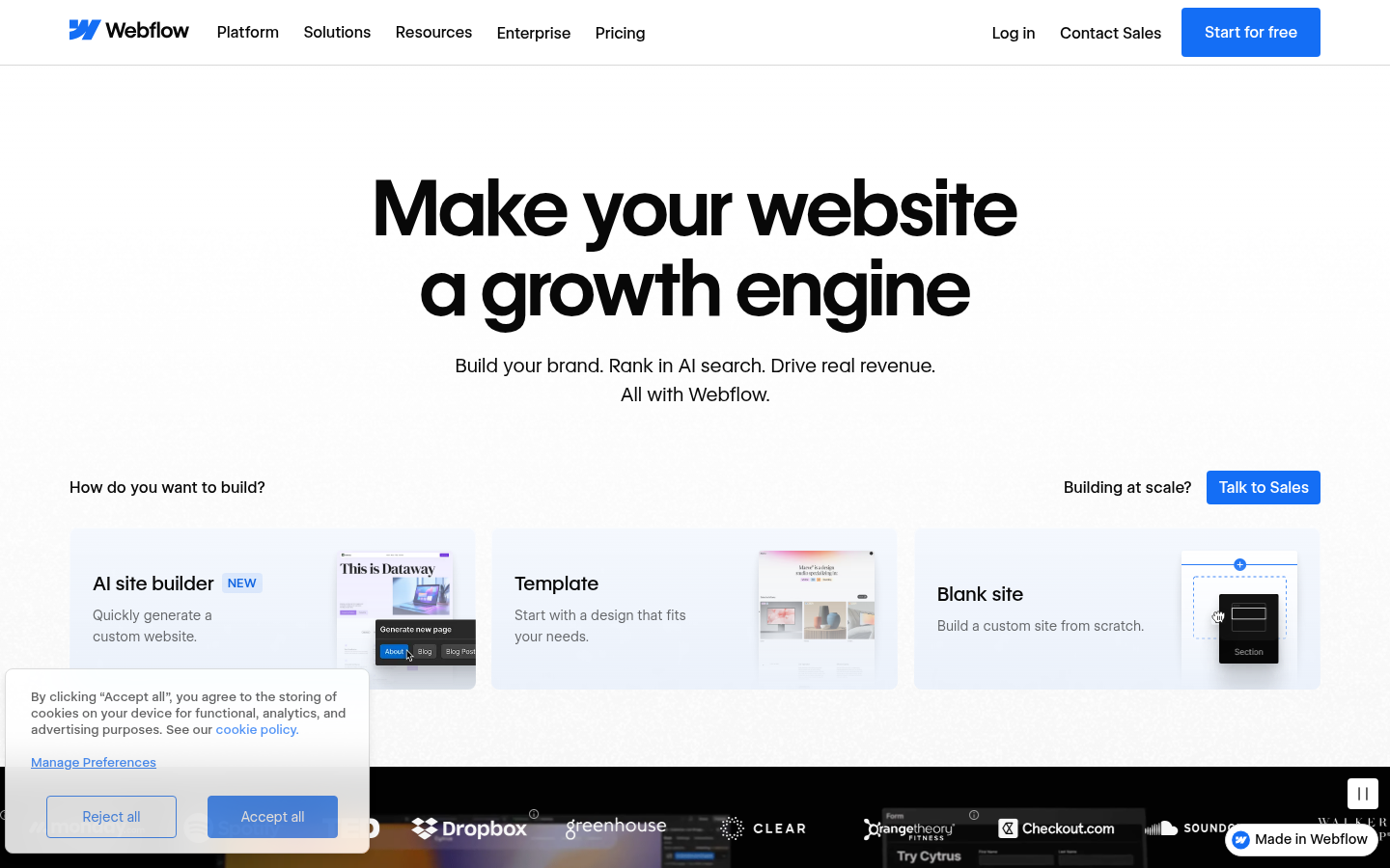
Webflow GradientsWebflow (webflow.com) — Prominent gradient hero sections with purple-to-blue transitions.
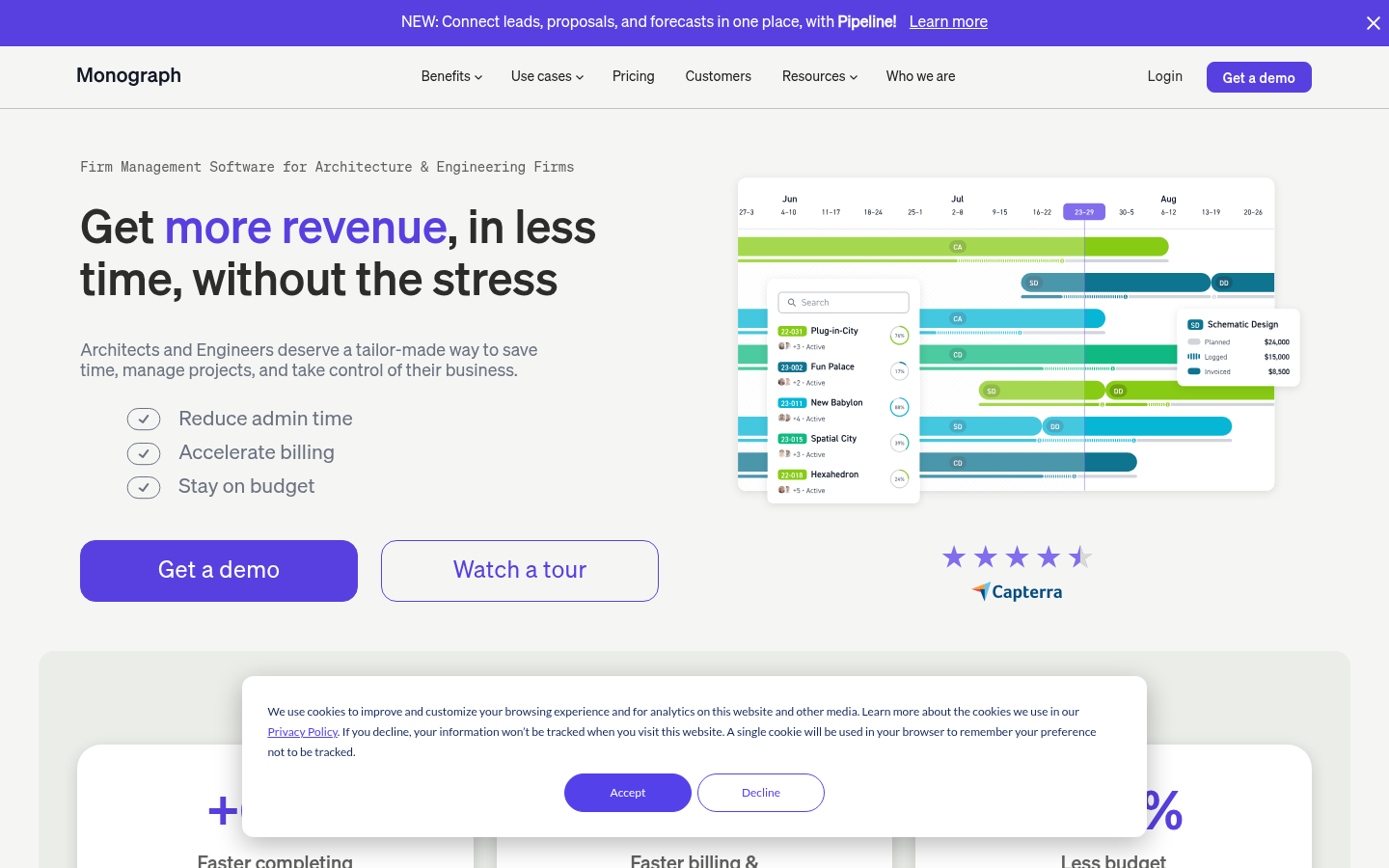
Monograph GradientsMonograph (monograph.com) — Every page features different gradient backgrounds.
Also Known As: 3D UI, Isometric Illustration, WebGL Design, Spline Design
Overview
3D design in web contexts ranges from isometric illustrations to full WebGL experiences. Modern tools like Spline, Three.js, and Blender make 3D increasingly accessible. Isometric design specifically uses a 30-degree angle to create depth without perspective distortion.
Key Visual Characteristics
Three-dimensional elements: Objects with depth
Isometric perspective: 30-degree angle, no vanishing points
Rendered 3D graphics: Realistic or stylized 3D
Interactive 3D: Objects that respond to mouse/scroll
3D typography: Extruded, rotated text
Product visualization: 3D product renders
Abstract shapes: Floating 3D primitives
Shadows and lighting: Realistic shadow systems
Animation: 3D objects in motion
Immersive experiences: Full 3D environments
When It Emerged / Peaked
Isometric illustration: steady presence since 2015. WebGL experiences: continuous growth. Spline-style 3D: peaked 2021-2024. Now mainstream for product sites and creative studios.
Best Use Cases
Product showcases
Tech company landing pages
Gaming sites
Creative studio portfolios
Educational/explainer content
Architecture and real estate
Interactive storytelling
Brand experiences
Example Websites
Lusion 3DLusion (lusion.co) — Award-winning WebGL studio, homepage is a full immersive 3D experience.
Bruno Simon 3DBruno Simon (bruno-simon.com) — Drive a 3D car through an interactive portfolio.
Three.jsThree.js (threejs.org) — The Three.js homepage showcases rotating 3D geometry.
13.
Y2K / Retro Revival
Also Known As: Y2K Aesthetic, Millennium Style, Early Internet Nostalgia, Frutiger Aero
Overview
Y2K Revival celebrates the optimistic, tech-utopian aesthetics of 1997-2004. Think bubble fonts, chrome effects, translucent plastic, aurora gradients, and the belief that technology would create a better future. Frutiger Aero specifically references the glossy, nature-meets-tech aesthetic of Windows Vista/7 era.
Key Visual Characteristics
Bubble/blob shapes: Soft, organic forms
Chrome and metallic effects: Reflective, liquid metal
Translucent materials: Clear plastic, glass, gel
Aurora gradients: Iridescent color shifts
Bubble fonts: Rounded, playful typography
Tech optimism: Futuristic but friendly
Nature + technology: Plants, water, combined with tech
Gloss and shine: Everything reflective
CD/DVD aesthetics: Holographic, iridescent
Pixelated elements: Low-res mixed with high-res
When It Emerged / Peaked
Original era: 1998-2004. Revival began around 2019, peaked 2022-2024 driven by Gen Z nostalgia for aesthetics they're too young to remember firsthand.
Best Use Cases
Fashion and youth brands
Music (especially electronic, pop)
Social media campaigns
Festival and event marketing
Lifestyle and beauty
Entertainment and media
Nostalgia-driven campaigns
Brands targeting Gen Z
Example Websites
Starface Y2KStarface (starface.world) — Skincare with chrome textures, bubble shapes, bright Gen Z colors.
SSENSE Y2KSSENSE (ssense.com) — Fashion platform with high-contrast minimal/maximal Y2K editorial style.
14.
Organic / Blob Shapes
Also Known As: Blob Design, Organic Shapes, Fluid Design, Amorphous UI
Overview
Organic shapes break free from rectangular constraints, using curved, flowing forms that feel natural and approachable. Blobs can be decorative backgrounds, section dividers, or integrated UI elements. They soften digital interfaces and create visual interest.
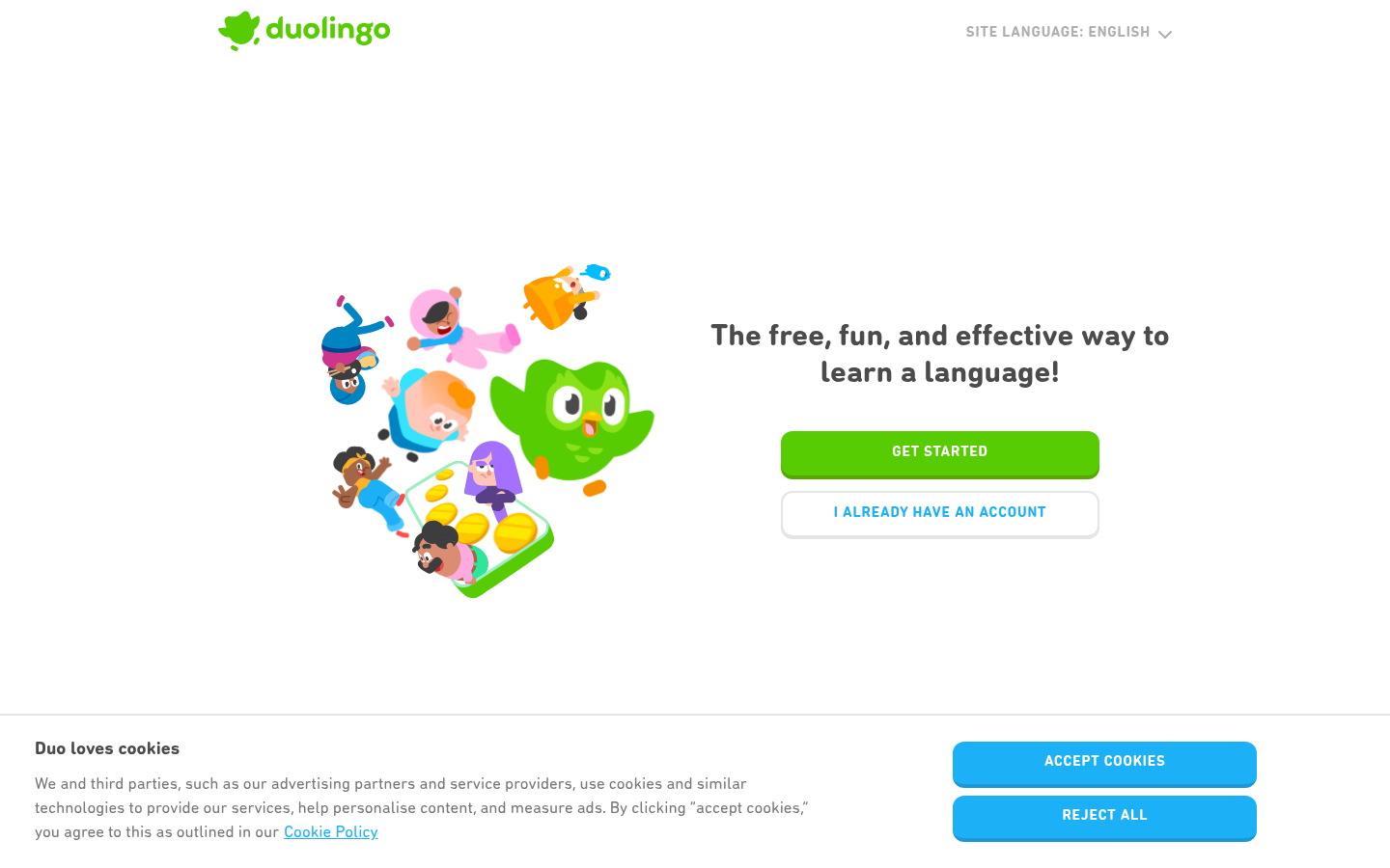
Also Known As: Clay UI, 3D Soft Design, Inflated Design
Overview
Claymorphism makes UI elements look like colorful clay or inflated 3D objects. It combines the softness of neumorphism with the dimensionality of 3D, creating playful, tactile interfaces that feel like stylized plastic toys.
Key Visual Characteristics
3D extruded shapes: Elements with visible depth
Soft, rounded corners: Extra-radius rounding
Pastel colors: Soft, friendly color palettes
Dual shadows: Inner and outer soft shadows
Inflated appearance: Elements look puffy
Matte textures: Not glossy, slightly textured
Playful aesthetic: Toy-like, approachable
Simple gradients: Subtle depth gradients
Consistent lighting: Single light source
Bold, rounded type: Matching the puffy aesthetic
When It Emerged / Peaked
Emerged 2021 as evolution of neumorphism. Peaked 2022-2023. More niche than other trends but distinctive.
Best Use Cases
Mobile apps for younger audiences
Gaming interfaces
Educational children's apps
Onboarding flows
Fintech for consumers (making finance friendly)
Entertainment and media
Creative tools
Marketing microsites
Example Websites
Android ClaymorphismAndroid (android.com) — Bugdroid mascot and UI with 3D clay-style rendering.
Duolingo ClaymorphismDuolingo (duolingo.com) — Puffy, inflated 3D character illustrations and soft-shadow UI.
16.
Memphis Design
Also Known As: Memphis Milano, 80s Design, Postmodern Design
Overview
Memphis Design originated in 1980s Milan, deliberately clashing with "good taste" through bold patterns, arbitrary shapes, and unexpected color combinations. In web design, it brings energy, playfulness, and retro appeal—perfect for brands wanting to stand out.
Also Known As: Neon UI, Synthwave Design, Outrun Aesthetic, Blade Runner Style
Overview
Cyberpunk aesthetic draws from sci-fi visions of dystopian futures: neon lights against dark backgrounds, glitch effects, tech-noir atmosphere. It's dramatic, immersive, and perfect for entertainment, gaming, and brands wanting to signal edgy futurism.
Key Visual Characteristics
Dark backgrounds: Near-black bases
Neon colors: Cyan, magenta, electric blue, hot pink
Glowing effects: Text and elements with glow
Glitch effects: Digital distortion, chromatic aberration
Grid patterns: Perspective grids (Tron aesthetic)
Japanese/Asian typography: Kanji, neon signs
Urban imagery: City skylines, rain, fog
Tech elements: Circuits, code, interfaces
Scanlines: CRT monitor effects
Animated effects: Flickering, pulsing lights
When It Emerged / Peaked
Influenced by 1980s films (Blade Runner). Web presence steady since 2015. Peaked with Cyberpunk 2077 release (2020). Remains strong in gaming and music spaces.
Best Use Cases
Gaming and esports
Electronic music
Tech brands wanting edge
Film and entertainment
Nightlife and events
Streetwear brands
VR/AR experiences
Crypto and Web3 (when not avoiding hype)
Example Websites
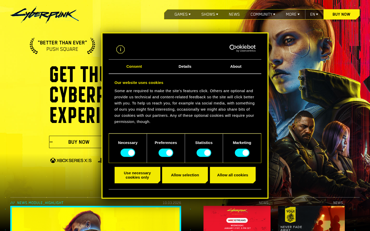
Cyberpunk 2077Cyberpunk 2077 (cyberpunk.net) — Neon yellow/pink on black, glitch effects, sci-fi UI.
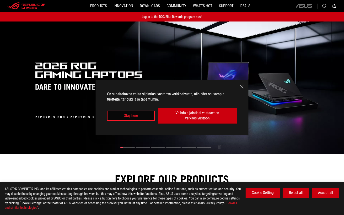
ASUS ROG CyberpunkASUS ROG (rog.asus.com) — Neon red accents, dark backgrounds, angular sci-fi UI.
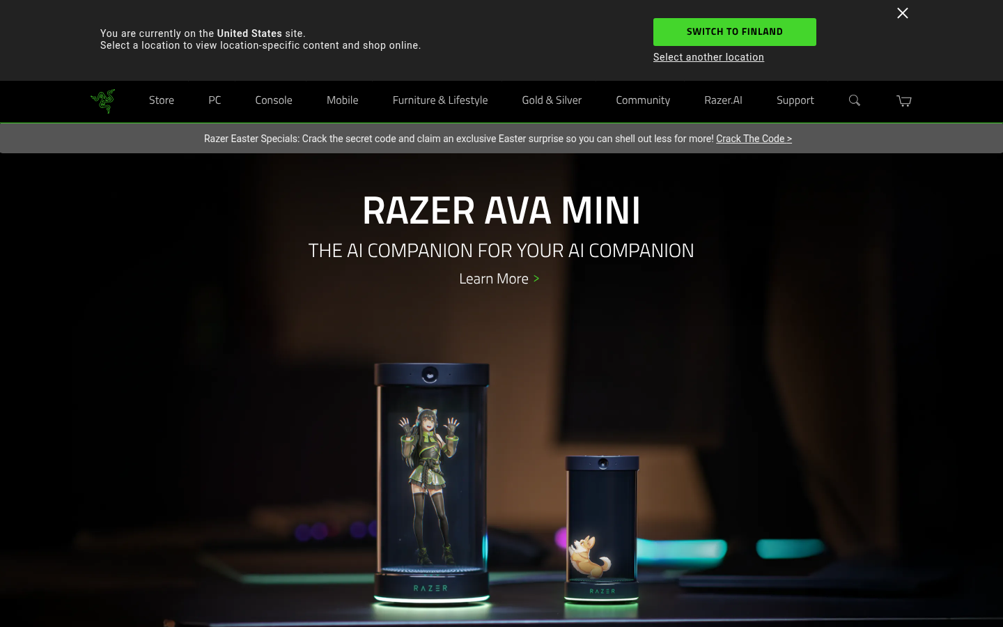
Razer CyberpunkRazer (razer.com) — Neon green glow on black, angular layouts, futuristic dark aesthetic.
18.
Corporate Memphis / Alegria
Also Known As: Alegria Style, Big Tech Illustration, Globohomo, Flat Illustration
Overview
Corporate Memphis refers to the flat, simplified illustration style that dominated big tech in the late 2010s. Characterized by disproportionate bodies, flat colors, and generic scenes of diverse people doing activities. Named after the Memphis Group (unfairly) and popularized by Facebook's Alegria illustration system.
Key Visual Characteristics
Flat illustration style: No depth or perspective
Disproportionate bodies: Long limbs, small heads
Blue/purple skin tones: Deliberately unrealistic
Geometric simplification: Bodies as shapes
Generic diversity: Representation without specificity
Activity scenes: People working, collaborating, celebrating
Bright, friendly colors: Non-threatening palette
Minimal detail: Maximum abstraction
Consistent style: Same across different companies
Vector-based: Clean, scalable graphics
When It Emerged / Peaked
Emerged 2017. Peaked 2018-2020. Significant backlash began 2021. Now declining, replaced by more distinctive illustration styles, AI-generated imagery, or photography.
Best Use Cases
Ironically, its ubiquity makes it less useful:
Budget-conscious startups needing illustration
Internal corporate communications
Generic SaaS when illustration budget is minimal
Situations where "safe" trumps "distinctive"
Note: Many brands now avoid this style due to its association with corporate blandness.
Example Websites
Gusto AlegriaGusto (gusto.com) — HR platform using flat illustrations with bendy limbs and non-realistic skin tones.
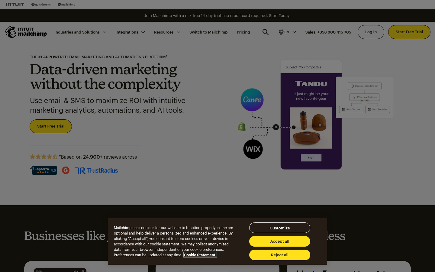
Mailchimp AlegriaMailchimp (mailchimp.com) — Distinctive flat illustration style with quirky characters.
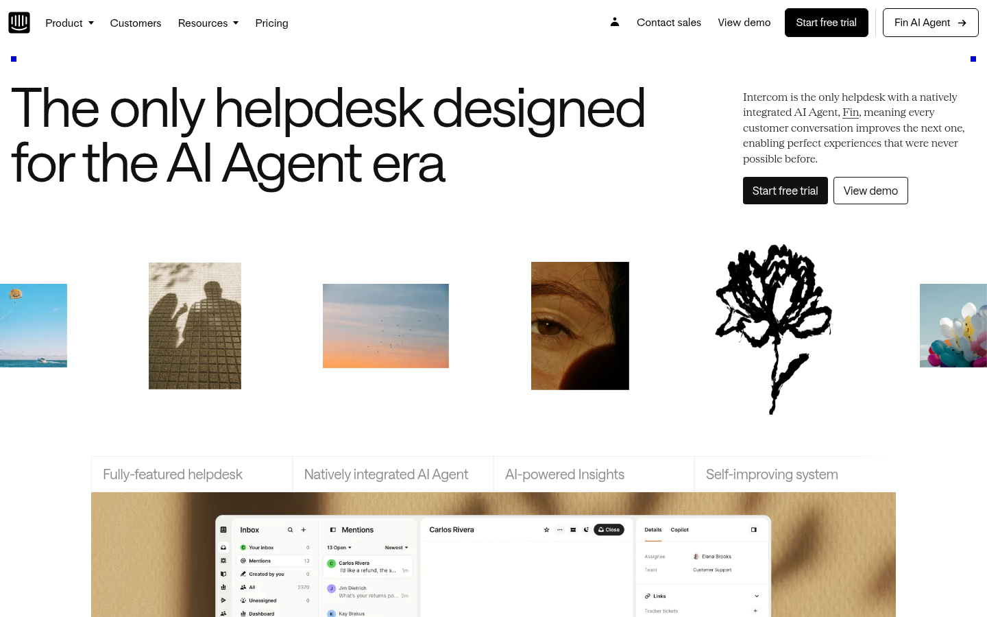
Intercom AlegriaIntercom (intercom.com) — Custom flat-style character illustrations with disproportionate features.
19.
Anti-Design
Also Known As: Ugly Design, Deconstructed Design, Punk Web Design
Overview
Anti-Design deliberately violates design conventions. It's not accidentally bad—it's intentionally provocative. Overlapping elements, unreadable text, chaotic compositions, and broken grids create experiences that challenge and disorient, asserting that design can be art, not just communication.
Key Visual Characteristics
Overlapping elements: Text on text, images on images
"Unreadable" typography: Distorted, obscured, or tiny text
Rejection of UX best practices: Deliberately "unusable"
When It Emerged / Peaked
Always existed in avant-garde circles. Web presence grew 2016-2020. Continues in fashion, art, and experimental creative spaces.
Best Use Cases
Art and cultural institutions
Fashion (experimental)
Music (experimental, electronic, art-pop)
Design studios signaling creativity
Digital art projects
Zines and independent publishing
When the message IS the confusion
Deliberately alienating mainstream audiences
Example Websites
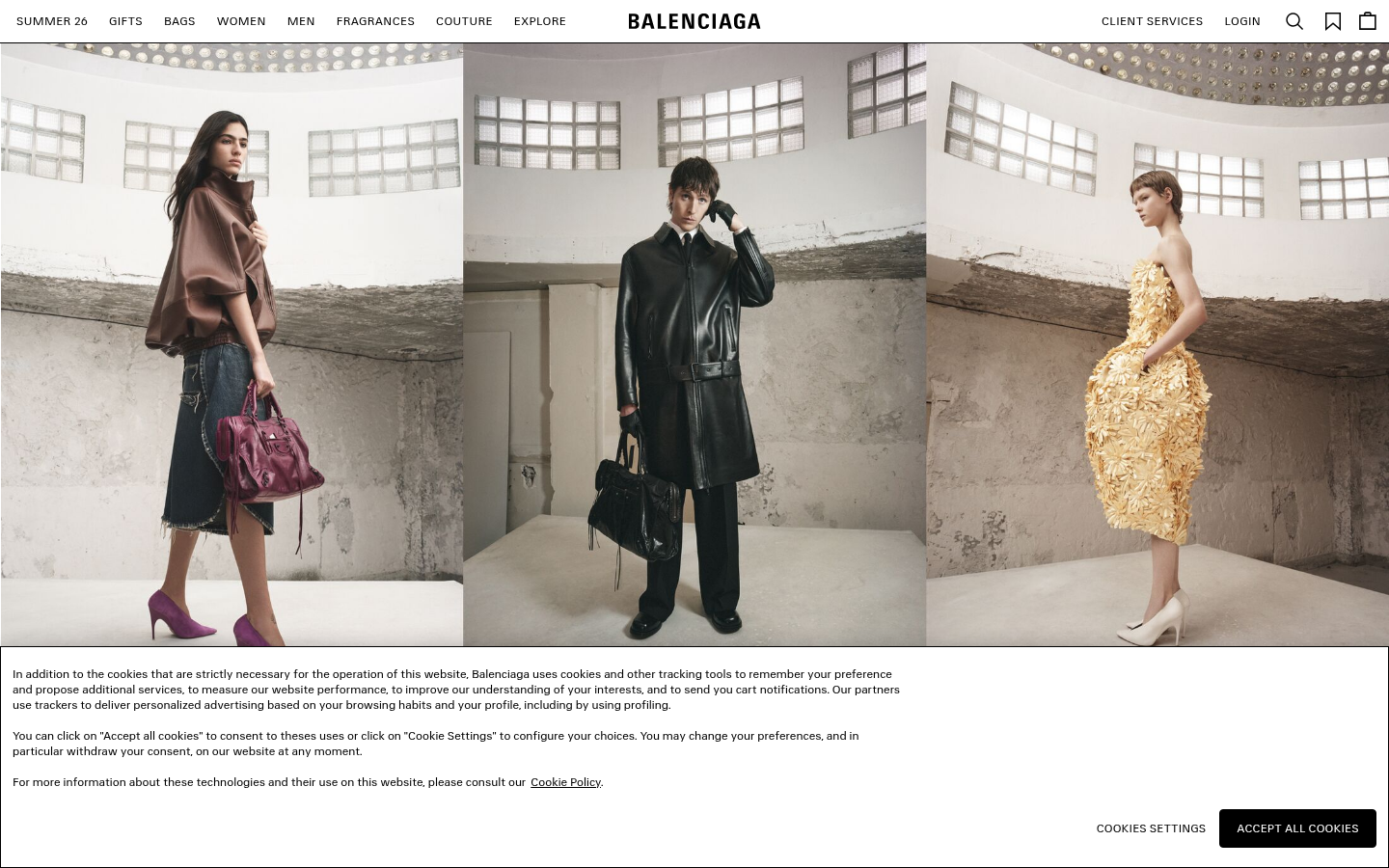
Balenciaga Anti-DesignBalenciaga (balenciaga.com) — Famously stark homepage with minimal text and deliberate stripping.
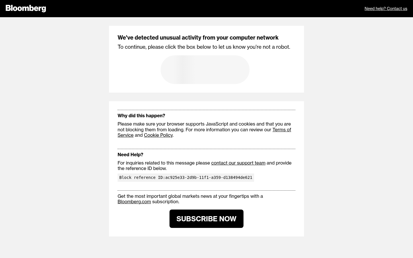
Bloomberg Anti-DesignBloomberg Businessweek (bloomberg.com/businessweek) — Clashing colors, overlapping elements, chaotic editorial layouts.
20.
Kinetic / Motion-Heavy Design
Also Known As: Motion Design, Animation-First Design, Scroll-Triggered Animation
Overview
Motion-heavy design treats animation as a first-class citizen, not an afterthought. Scroll-triggered animations, loading sequences, micro-interactions, and full page transitions create dynamic experiences that feel alive. When done well, motion guides attention and delights; done poorly, it frustrates.
Key Visual Characteristics
Scroll-triggered animations: Elements animate on scroll
Growing since GSAP matured (2012+). Accelerated with Framer Motion, Lottie (2017+). Now mainstream, with best practices emerging around performance and accessibility.
Also Known As: Magazine Layout, Editorial Design, Typographic Design
Overview
Editorial design brings print magazine sensibilities to the web: dramatic typography, intentional white space, grid-based layouts, and a focus on reading experience. It treats content as hero and design as frame.
Key Visual Characteristics
Large headlines: Dramatic, expressive typography
Column layouts: Multiple text columns
Drop caps: Large initial letters
Pull quotes: Highlighted text excerpts
White space: Deliberate emptiness
Photography as hero: Full-bleed images
Grid structures: Mathematical layouts
Article typography: Optimized for reading
Section divisions: Clear content separation
Print conventions: Page numbers, mastheads
When It Emerged / Peaked
Print editorial design has centuries of history. Web editorial evolved with Responsive Design (2010+) and improved typography support. Continues strong in publishing.
Best Use Cases
News and journalism
Magazine websites
Longform content
Blog and article sites
Literary publications
Cultural commentary
Brand storytelling
Annual reports
Example Websites
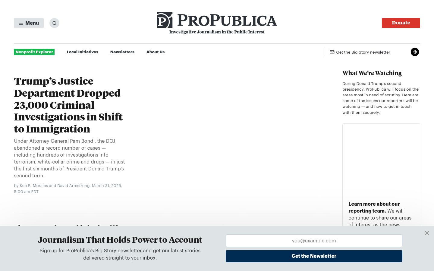
ProPublica EditorialProPublica (propublica.org) — Investigative journalism with magazine-style layouts and bold editorial typography.
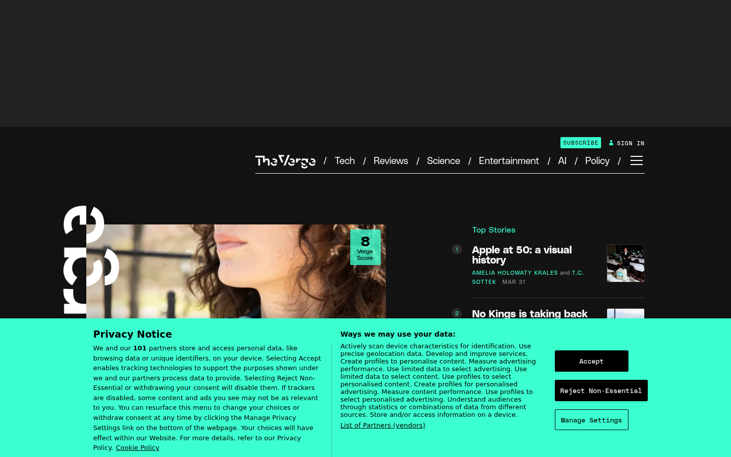
The Verge EditorialThe Verge (theverge.com) — Bold editorial layout with dramatic typography and magazine-style hierarchy.
Aeon EditorialAeon (aeon.co) — Long-form essay platform with editorial typography and magazine-quality layout.
22.
Hand-Drawn / Illustrated
Also Known As: Illustration-First Design, Custom Illustration, Whimsical Design
Overview
Hand-drawn design prioritizes custom illustration over photography or stock assets. From whimsical doodles to sophisticated artwork, illustration can give brands a distinctive voice impossible to replicate with photos.
Varied styles: From line drawings to detailed paintings
Character design: Mascots or illustrated people
Textured brushwork: Visible artistic process
Animated illustrations: Moving artwork
Illustrated icons: Hand-drawn iconography
Mixed media: Illustration + photography
Consistent art direction: Unified visual style
Storytelling elements: Narrative illustrations
Handwritten typography: Custom lettering
When It Emerged / Peaked
Always present in design. Mailchimp's Freddie (2001+) made tech illustration mainstream. Peaked as Corporate Memphis fatigue created demand for distinctive alternatives.
Best Use Cases
Brands needing differentiation
Children's products
Creative services
Food and lifestyle
Education and learning
Entertainment
Local businesses
Any brand with "personality" as a value
Example Websites
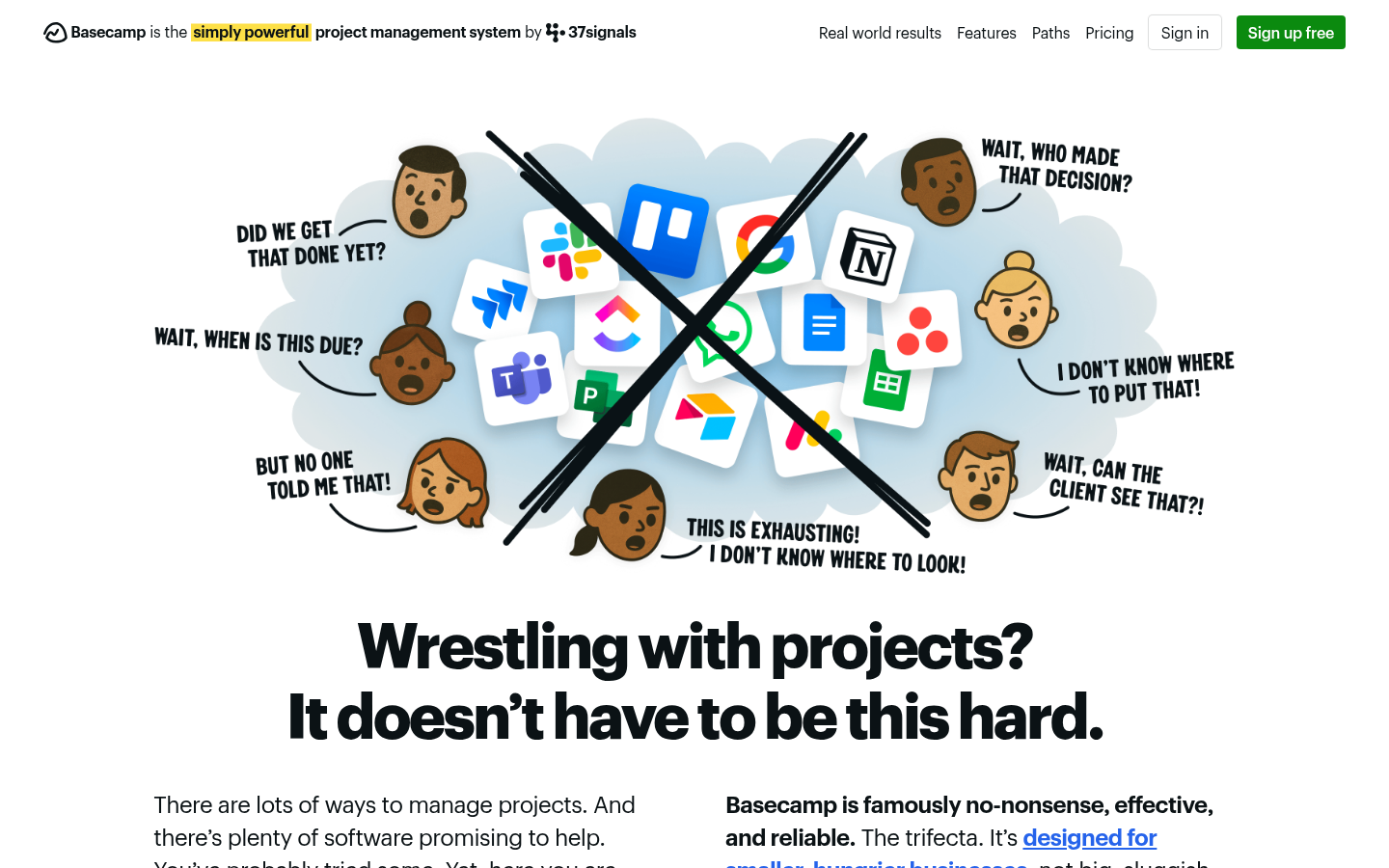
Basecamp IllustratedBasecamp (basecamp.com) — Custom hand-drawn illustrations with distinctive whimsical style.
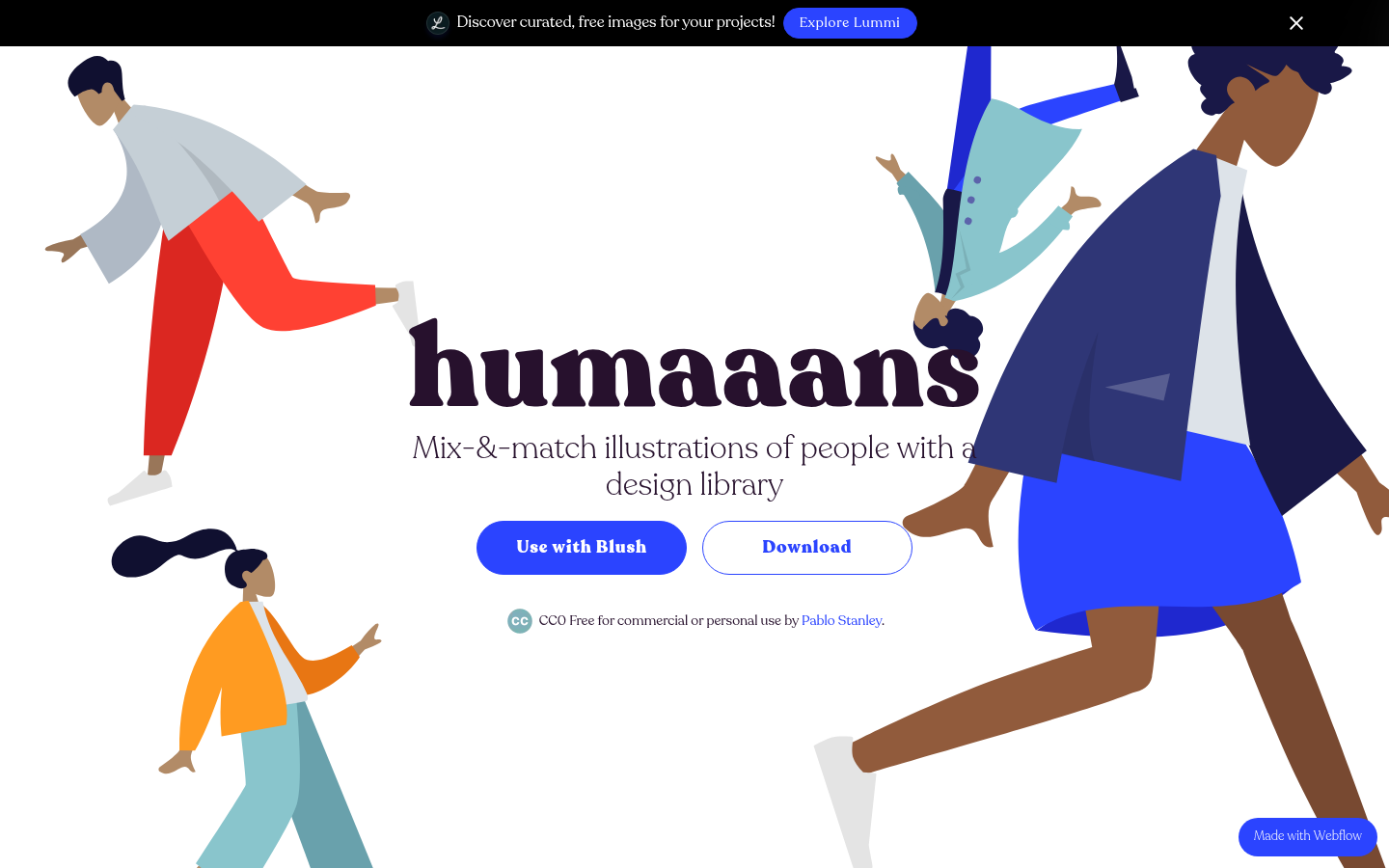
Humaaans IllustratedHumaaans (humaaans.com) — Illustration library site fully illustrated with customizable flat people.
23.
Monochrome / Duotone
Also Known As: One-Color Design, Duotone Design, Limited Palette
Overview
Monochrome design limits the palette to one hue (plus neutrals), while duotone uses two. The constraint forces creative solutions and creates striking, unified aesthetics. Popular in editorial, music, and brands wanting bold simplicity.
Key Visual Characteristics
Single hue: One color + black/white
Duotone images: Photos filtered to two colors
Strong contrast: Light vs. dark values
Typography focus: Color limitation emphasizes type
Mood setting: Color choice defines emotion
Photography treatment: Images filtered/treated
Graphic simplicity: Reduced visual complexity
Brand consistency: Color becomes identity
Print influence: Resembles screen printing
Dramatic effect: Bold, memorable impression
When It Emerged / Peaked
Spotify's duotone campaign (2015) sparked widespread adoption. Peaked 2016-2019. Remains effective for specific applications.
Best Use Cases
Music and entertainment
Fashion photography
Brand campaigns
Portfolio sites
Landing pages
Event marketing
Editorial photography
Any brand with a strong signature color
Example Websites
Revolt MonochromeRevolt (rvlt.net) — Danish streetwear brand with stark monochrome photography.
Solopine MonochromeSolopine (solopine.com) — Black and white grain texture with minimalist monochrome design.
24.
Split-Screen Layouts
Also Known As: 50/50 Layout, Divided Screen, Dual-Panel Design
Overview
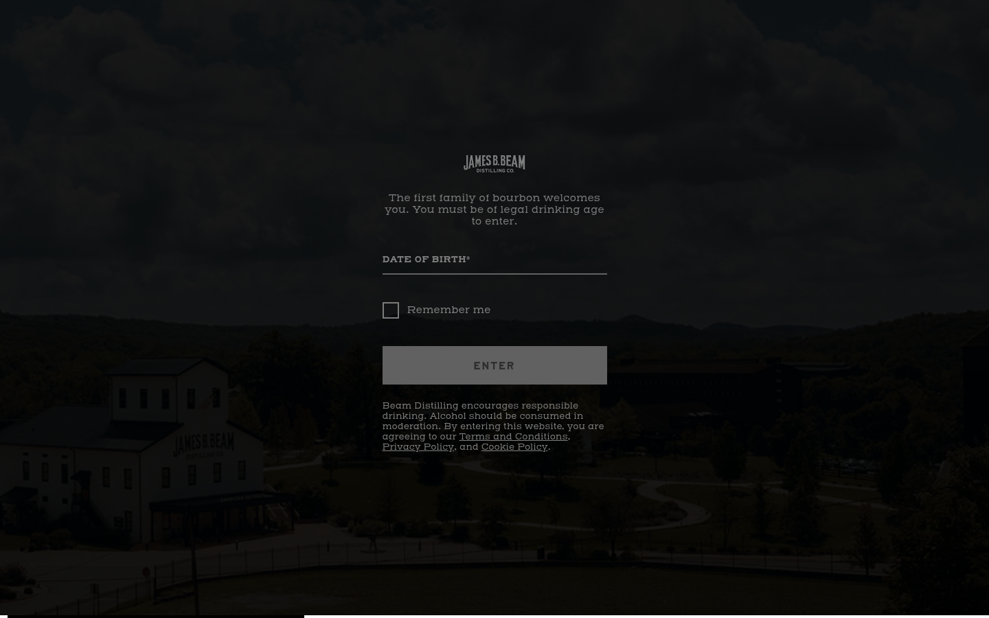
Split-screen layouts divide the viewport into two (or more) distinct sections, often for comparison, dual-navigation, or visual drama. They naturally create A/B choices and work well for brands with dual audiences or contrasting messages.
Hardins Creek Split-ScreenHardins Creek (hardinscreek.com) — Bourbon brand with dramatic split-screen age gate and product presentation.
25.
Asymmetric Grids
Also Known As: Broken Grid, Off-Grid Design, Irregular Layouts
Overview
Asymmetric grids deliberately break from predictable structures, creating dynamic, unexpected compositions. Elements overlap, extend beyond boundaries, and create visual tension that draws attention and signals creativity.
Key Visual Characteristics
Overlapping elements: Images and text intersecting
Offset positioning: Elements not aligned to obvious grid
Varied column widths: Unpredictable proportions
Breaking the container: Content extending beyond bounds
Diagonal relationships: Elements at angles
Intentional misalignment: Controlled "chaos"
White space tension: Uneven negative space
Layered depth: Elements stacked visually
Mixed media: Photos, text, shapes interacting
Desktop emphasis: Often simplifies on mobile
When It Emerged / Peaked
CSS Grid (2017) enabled easy implementation. Peaked 2018-2021. Now mature, used selectively for impact.
Best Use Cases
Creative studios
Art and design portfolios
Fashion and luxury
Architecture
Music and entertainment
Editorial features
Any brand prioritizing creativity over convention
Example Websites
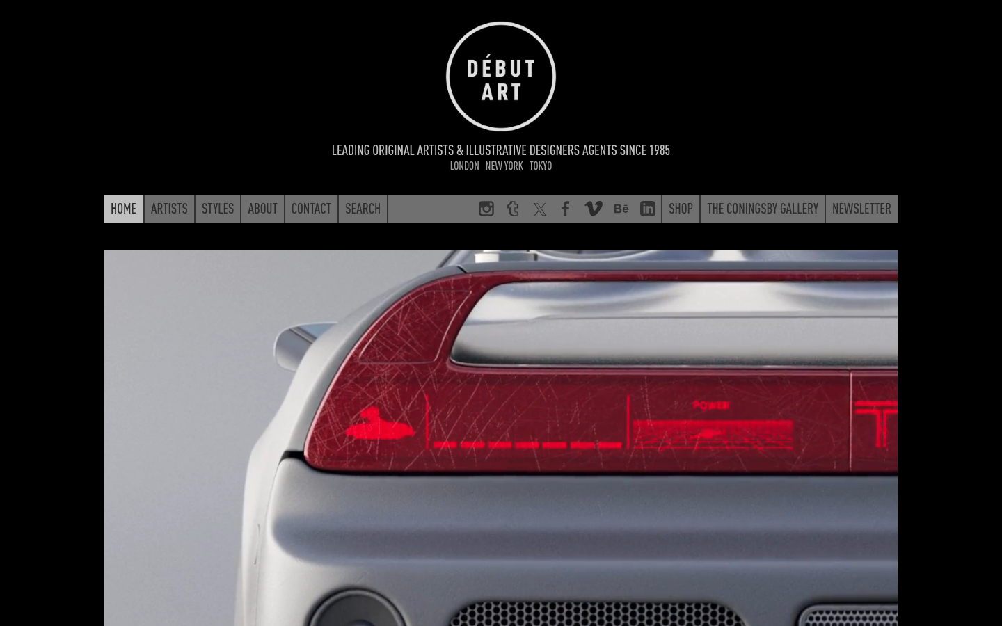
Debut Art AsymmetricDebut Art (debutart.com) — London art agency with asymmetric grid to showcase projects at varying importance.
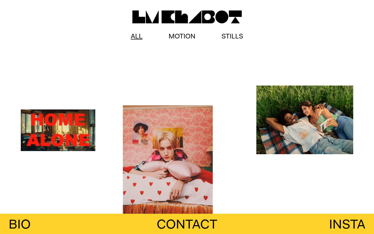
LM Chabot AsymmetricLM Chabot (lmchabot.com) — Photographer with off-centered images and irregular content placement.
26.
Big Typography / Type-First Design
Also Known As: Large Type, Expressive Typography, Type-Driven Design
Overview
Big typography makes type the primary design element, not a supporting player. Headlines at 10vw, variable fonts animated on scroll, and typography as imagery. It requires excellent font selection and careful hierarchy but creates immediate impact.
Key Visual Characteristics
Massive headlines: Text at viewport-width sizes
Typography as imagery: Text replacing graphics
Variable fonts: Animated weight and width
Minimal other elements: Type dominates
Strong hierarchy: Clear size relationships
Custom/display fonts: Distinctive typefaces
Vertical rhythm: Careful line spacing
Text animations: Letters moving, morphing
Overlapping text: Type as texture
Color in type: Gradients, fills in headlines
When It Emerged / Peaked
Growing since better web fonts (2010+). Variable fonts (2016) accelerated possibilities. Now mainstream, especially in creative industries.
Best Use Cases
Creative and design agencies
Portfolio sites
Fashion and luxury
Editorial and publishing
Music and entertainment
Minimalist branding
Statement pages
Hero sections
Example Websites
Dennis Snellenberg Big TypographyDennis Snellenberg (dennissnellenberg.com) — Developer portfolio with smooth text reveal animations.
Design Embraced Big TypographyDesign Embraced (designembraced.com) — Portfolio with enormous experimental typography as primary visual.
27.
Card-Based UI
Also Known As: Card Design, Card UI, Component-Based Layout
Overview
Card-based design organizes content into self-contained rectangular units that can be browsed, rearranged, and interacted with. Popularized by Pinterest and Material Design, cards create scannable, flexible interfaces ideal for varied content types.
Key Visual Characteristics
Rectangular containers: Content in distinct boxes
Consistent structure: Repeating card formats
Image + text: Visual and textual content combined
White backgrounds: Cards often light on dark/gray
Rounded corners: Soft, friendly feeling
Subtle shadows: Elevation indication
Grid layouts: Cards in rows and columns
Responsive flexibility: Cards reflow by viewport
Action triggers: Cards as clickable units
Content preview: Summary leading to detail
When It Emerged / Peaked
Pinterest (2010), Google Now (2012), Material Design (2014). Standard pattern throughout 2010s and remains fundamental.
Best Use Cases
Social media feeds
E-commerce product grids
Dashboard widgets
News and blog listings
Portfolio galleries
Search results
App interfaces
Any content listing
Example Websites
Pinterest CardsPinterest (pinterest.com) — The card layout originator.
Behance CardsBehance (behance.net) — Creative portfolios displayed in modular card grid.
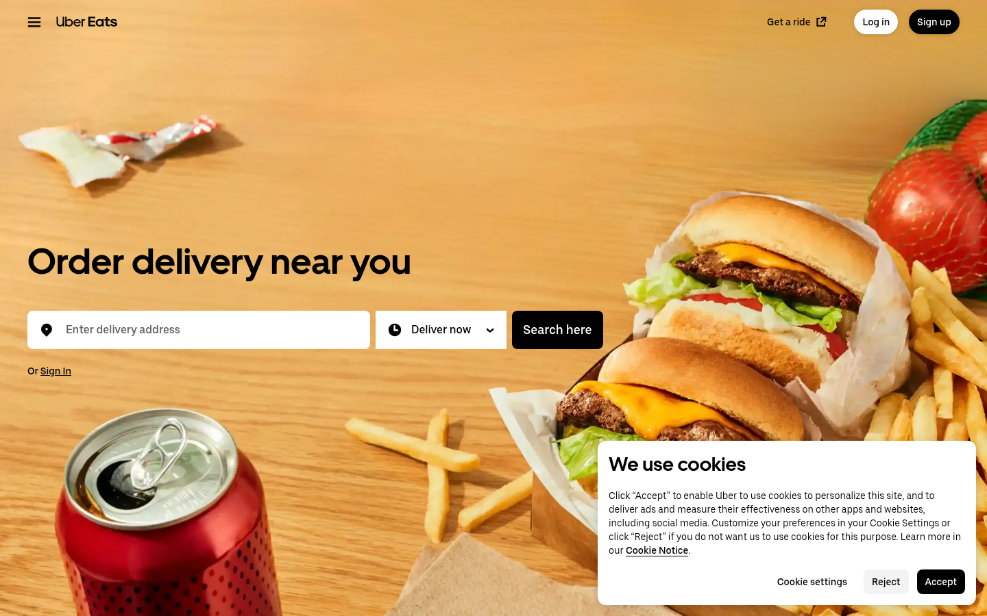
UberEats CardsUberEats (ubereats.com) — Restaurant and food cards organizing browsing into modular components.
28.
Parallax / Scroll-Driven Design
Also Known As: Parallax Scrolling, Scroll Animation, Scrollytelling
Overview
Parallax creates depth by moving background elements slower than foreground as users scroll. More broadly, scroll-driven design triggers animations and transitions based on scroll position, creating interactive storytelling experiences.
Key Visual Characteristics
Layered depth: Elements at different movement speeds
Scroll-triggered events: Content appears on scroll
Background movement: Backgrounds shifting with scroll
Cinematic reveals: Content dramatically appearing
Horizontal in vertical: Side-scrolling within vertical page
Sticky elements: Content that stays visible
Progress indicators: Visual scroll position markers
Chapter structures: Scroll = narrative progress
Zoom effects: Elements scaling with scroll
360-degree views: Products rotating on scroll
When It Emerged / Peaked
Initial hype 2011-2014. Backlash due to performance and usability. Mature, selective use 2018+. Now standard for storytelling and product sites.
Best Use Cases
Product launches
Interactive storytelling
Documentary and journalism
Brand experiences
Landing pages
Portfolio presentations
Annual reports
Explanatory content
Example Websites
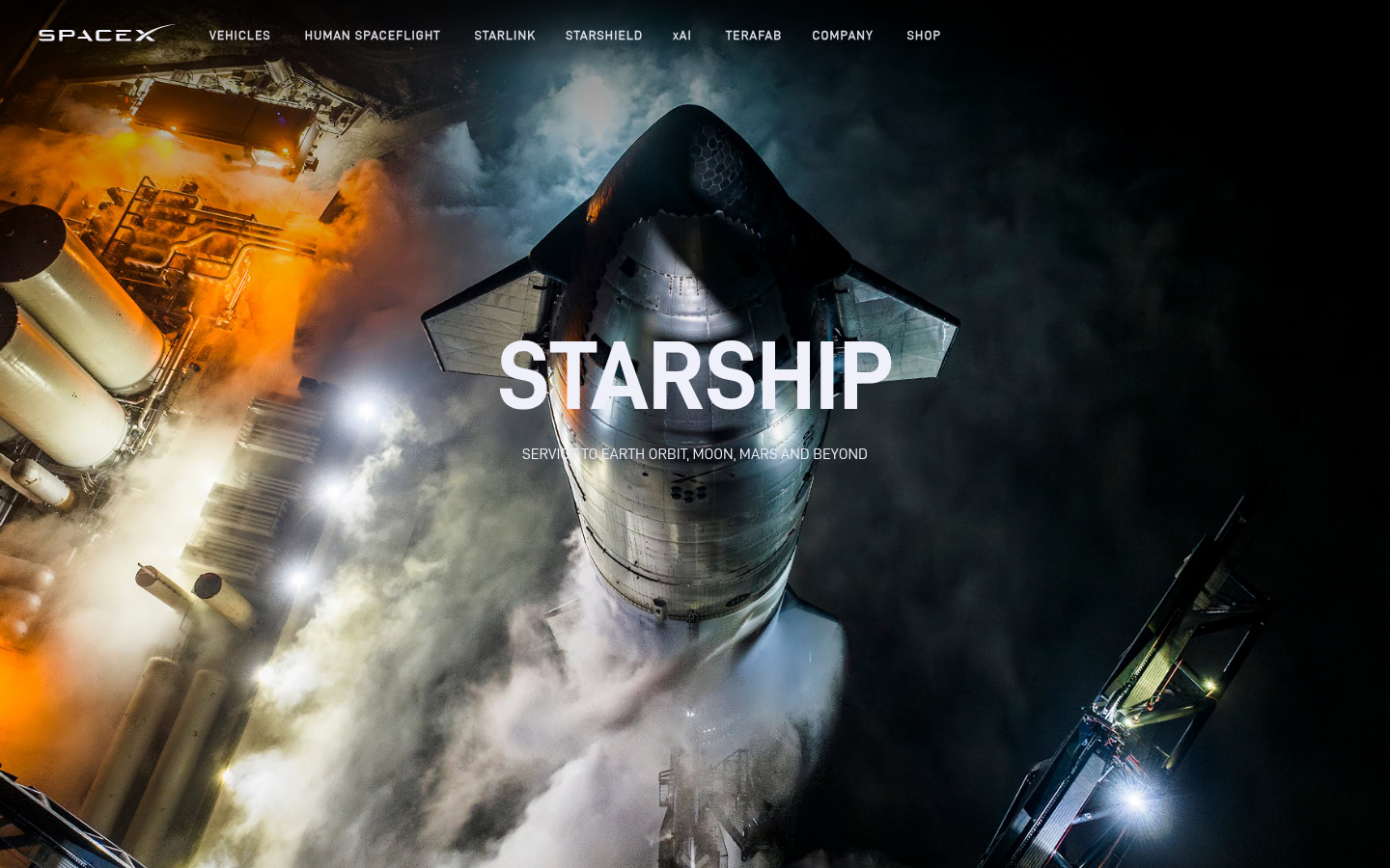
SpaceX ParallaxSpaceX Starship (spacex.com/vehicles/starship/) — Dramatic parallax through rocket stages.
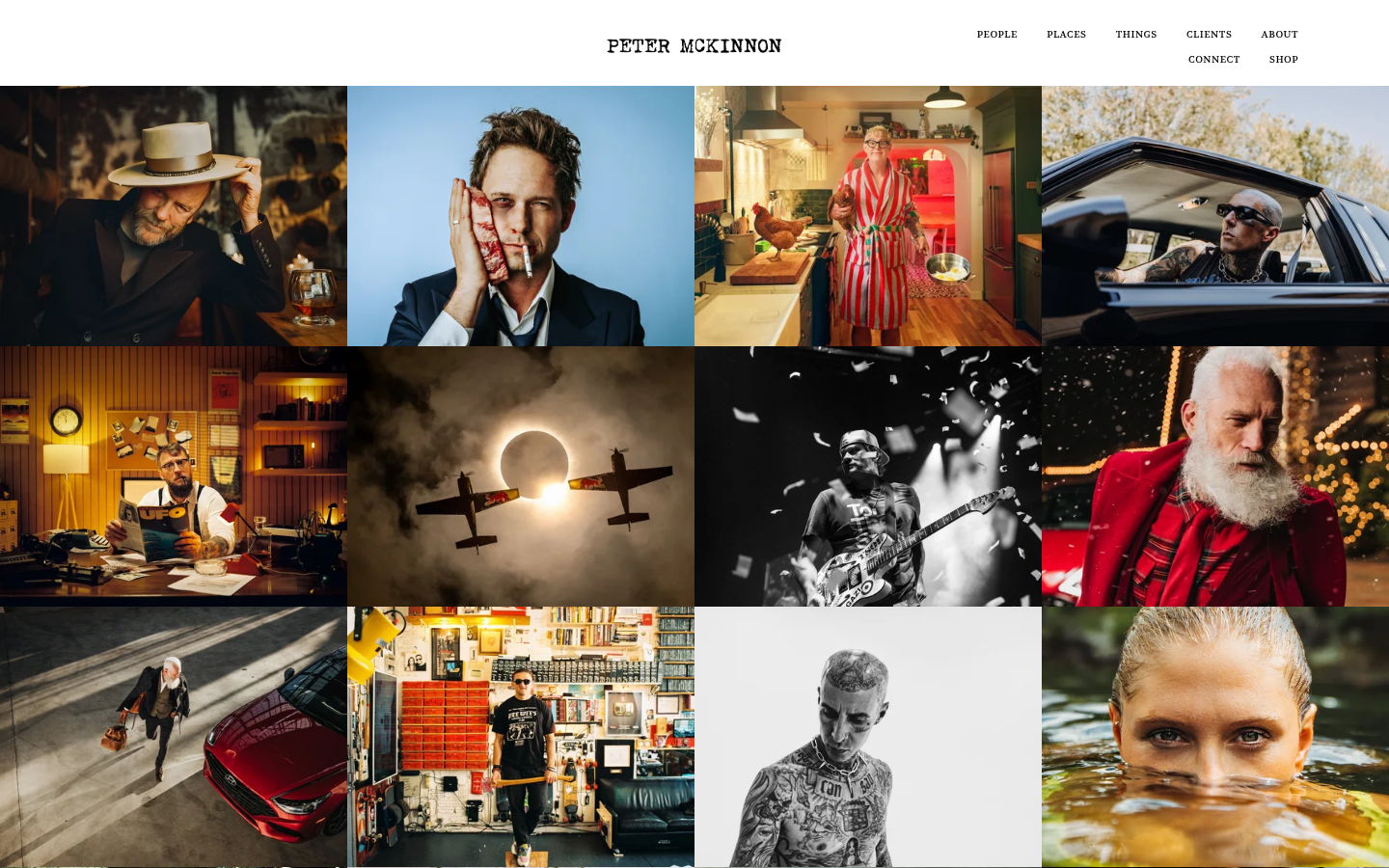
Peter McKinnon ParallaxPeter McKinnon (petermckinnon.com) — Full-screen parallax with immersive photography.
29.
Bento Box / Grid Layouts
Also Known As: Bento Grid, Feature Grid, Apple Bento
Overview
Named after Japanese bento boxes, this layout presents features or content in compact, varied-size rectangular cells. Apple's marketing pages popularized this approach, showing multiple product features simultaneously in a visually balanced grid.
Key Visual Characteristics
Varied cell sizes: Different sized rectangles
Tight arrangement: Minimal gaps between cells
Feature focus: One concept per cell
Mixed content: Text, images, videos in cells
Visual hierarchy: Larger cells = more important
Interactive cells: Cells may animate or expand
Modular structure: Cells can be rearranged
Rounded corners: Soft, contained feeling
Background contrast: Cells different from page background
Dense information: Multiple items visible at once
When It Emerged / Peaked
Apple started using extensively around 2019. Widely adopted 2021-present. Currently mainstream for feature/capability communication.
Best Use Cases
Product feature pages
Capability overviews
Dashboard summaries
Portfolio highlights
Service offerings
Technology overviews
About pages
Any multi-feature communication
Example Websites
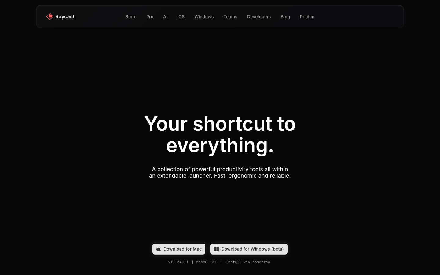
Raycast BentoRaycast (raycast.com) — Developer tool feature showcase in bento format.
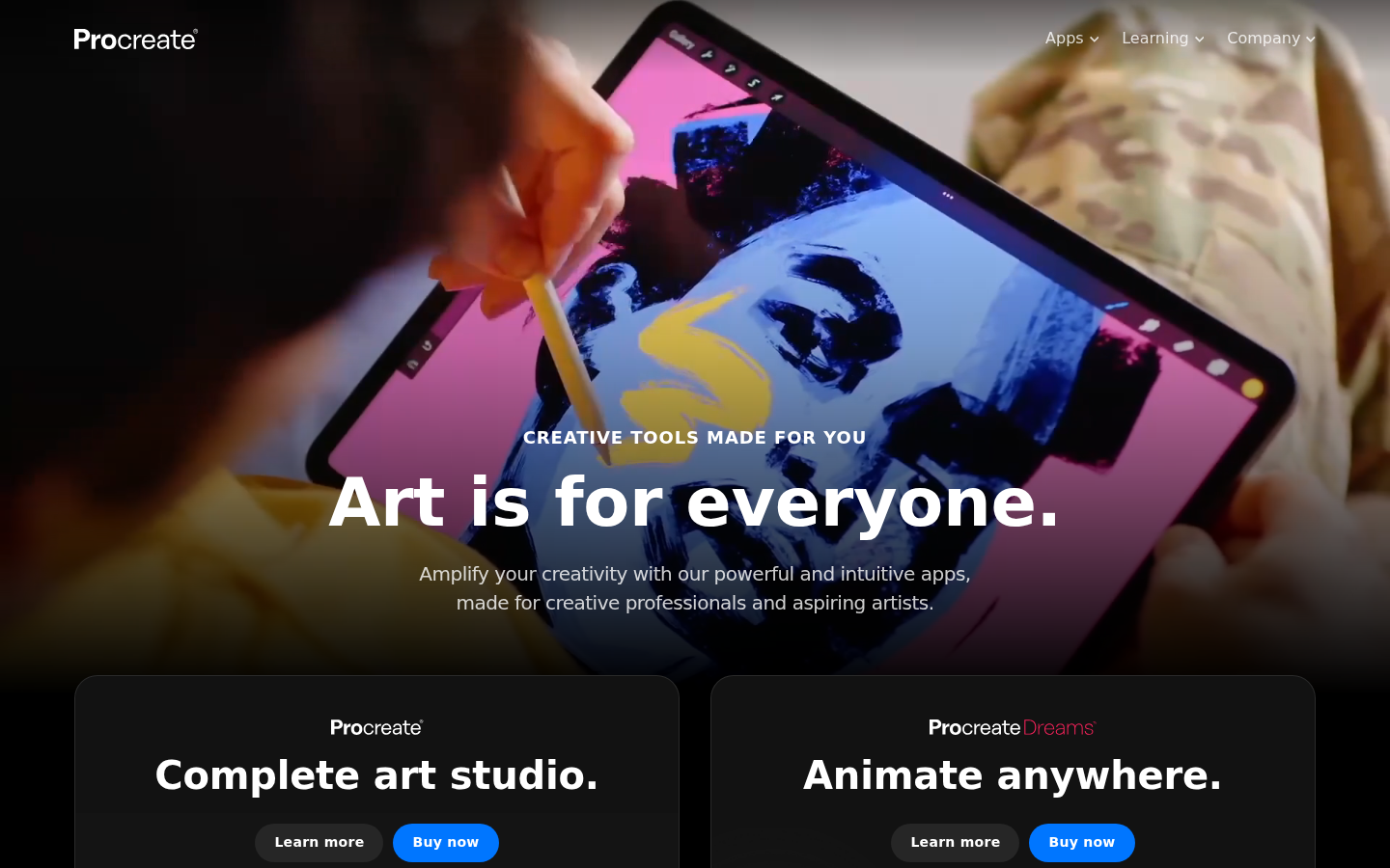
Procreate BentoProcreate (procreate.com) — Drawing app with bento grid and distinct feature blocks.
30.
Brutalism Lite / Post-Brutalism
Also Known As: Refined Brutalism, Accessible Brutalism, Neo-Brutalist
Overview
Brutalism Lite takes brutalist principles—bold typography, raw elements, high contrast—and makes them more accessible. It keeps the attitude but improves usability, creating designs that feel edgy without being antagonistic.
Key Visual Characteristics
Bold, system-stack typography: But well-sized and readable
High contrast: But WCAG compliant
Simple layouts: But with clear hierarchy
Visible structure: But intuitive navigation
Limited color: But harmonious palette
Thick borders: But purposeful, not arbitrary
Raw feeling: But polished execution
Flat design: But with personality
Deliberate constraints: But usable results
When It Emerged / Peaked
Evolution from pure brutalism, 2019-present. Growing as designers want edge without alienating users.
Best Use Cases
Tech startups
Creative tools
Developer products
Cultural institutions
Independent brands
SaaS products wanting differentiation
Any brand wanting to signal "we're different"
Example Websites
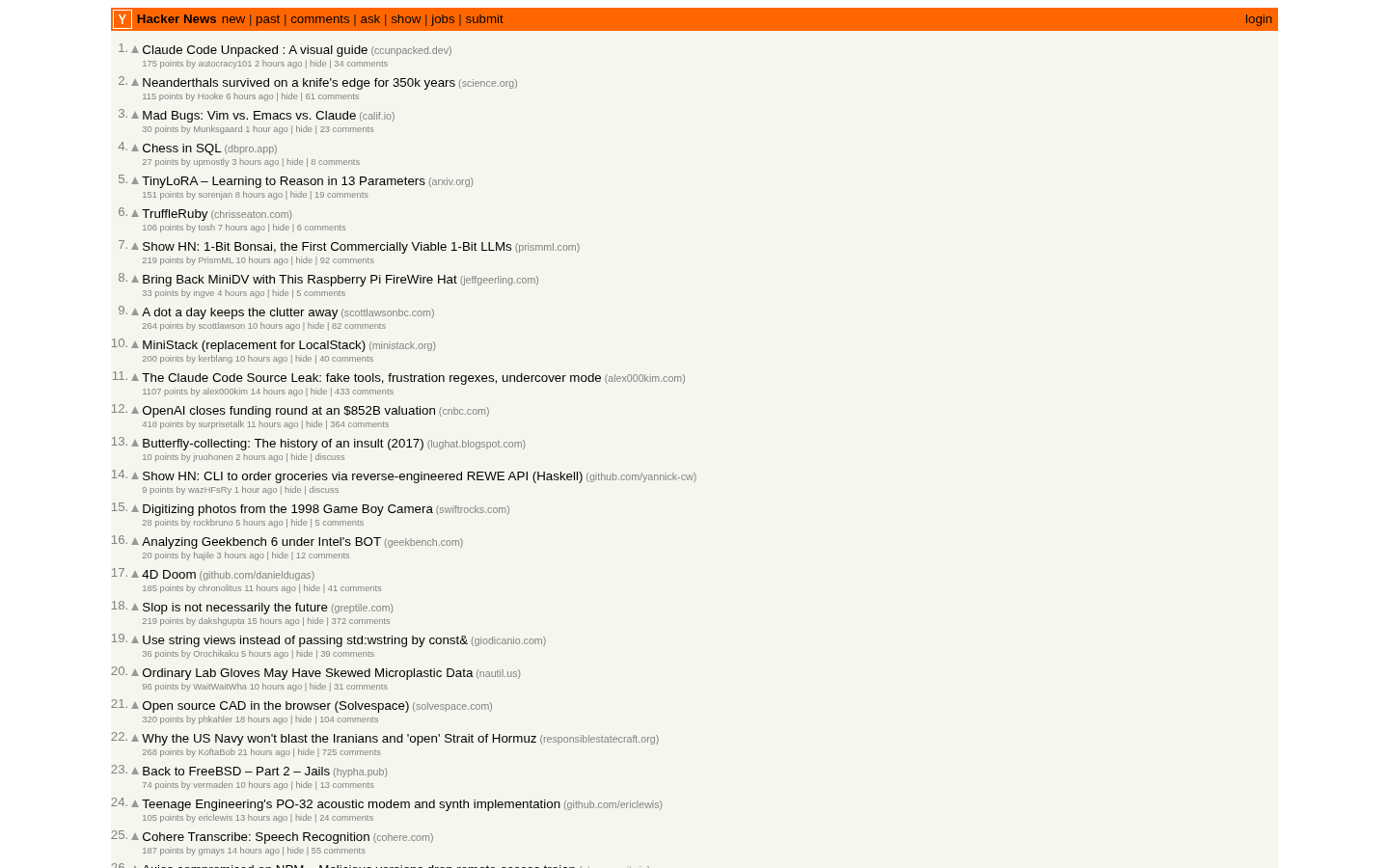
Hacker News Brutalism LiteHacker News (news.ycombinator.com) — Classic functional brutalism with zero decoration, pure content.
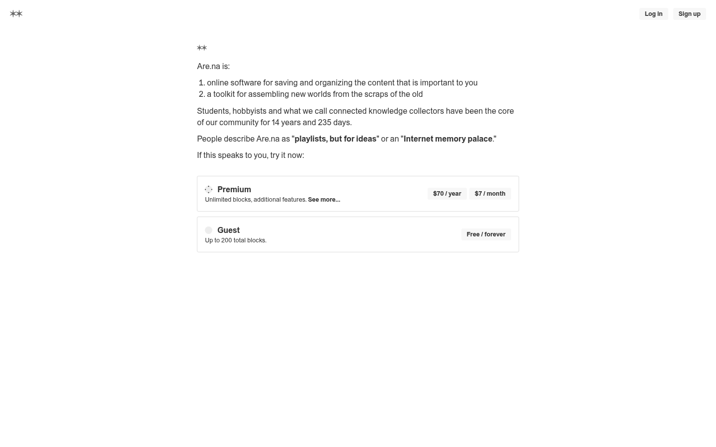
Are.na Brutalism LiteAre.na (are.na) — Research/bookmarking tool with clean spare design, raw typography.
31.
Aurora / Northern Lights Backgrounds
Also Known As: Aurora Backgrounds, Cosmic Gradients, Space Aesthetics
Overview
Aurora backgrounds create ethereal, cosmic effects reminiscent of northern lights or nebulae. They combine animated gradients, blur effects, and color shifts to create living, breathing backgrounds that feel magical without being distracting.
Key Visual Characteristics
Shifting color gradients: Slow, animated color changes
Blur effects: Soft, diffused light
Dark backgrounds: Colors pop against darkness
Organic movement: Natural, flowing animation
Multiple color points: Complex gradient interactions
Subtle grain/noise: Added texture
Responsive to interaction: Cursor influence sometimes
Performance-conscious: Optimized for smoothness
Blue/purple dominance: Cosmic color associations
Atmospheric depth: Layered, receding effects
When It Emerged / Peaked
Emerged 2020-2021. Strong 2022-2024 with AI and tech products. Continues in premium tech contexts.
Best Use Cases
AI and ML products
Developer tools
SaaS landing pages
Music and media
Premium tech brands
Fintech
Any product wanting "magical" feeling
Example Websites
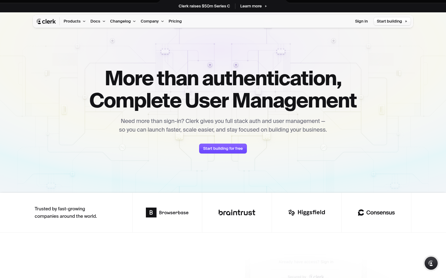
Clerk AuroraClerk (clerk.com) — Auth platform with aurora/cosmic gradient blending purples and teals.
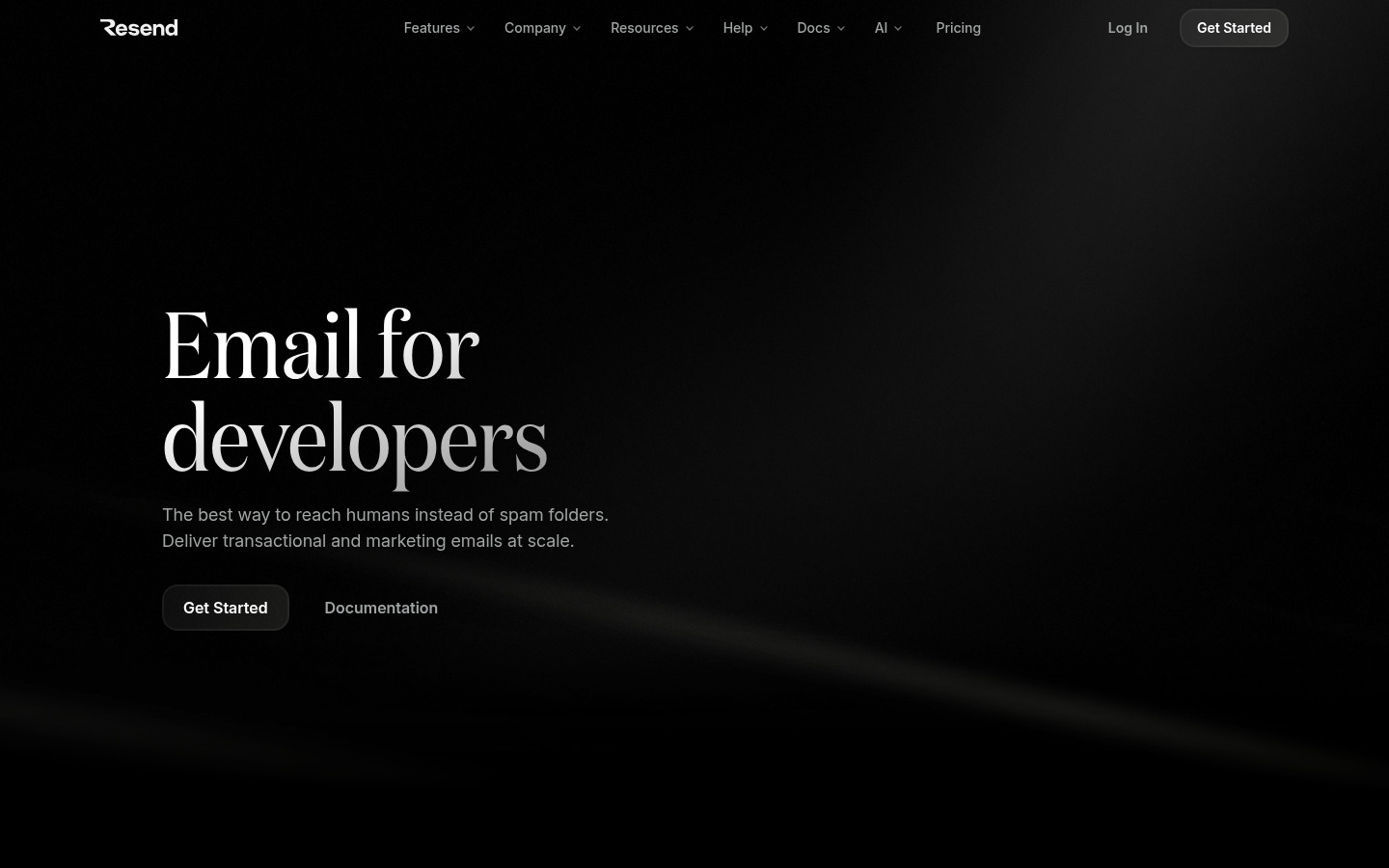
Resend AuroraResend (resend.com) — Email API with aurora-style purple and blue gradient glows.
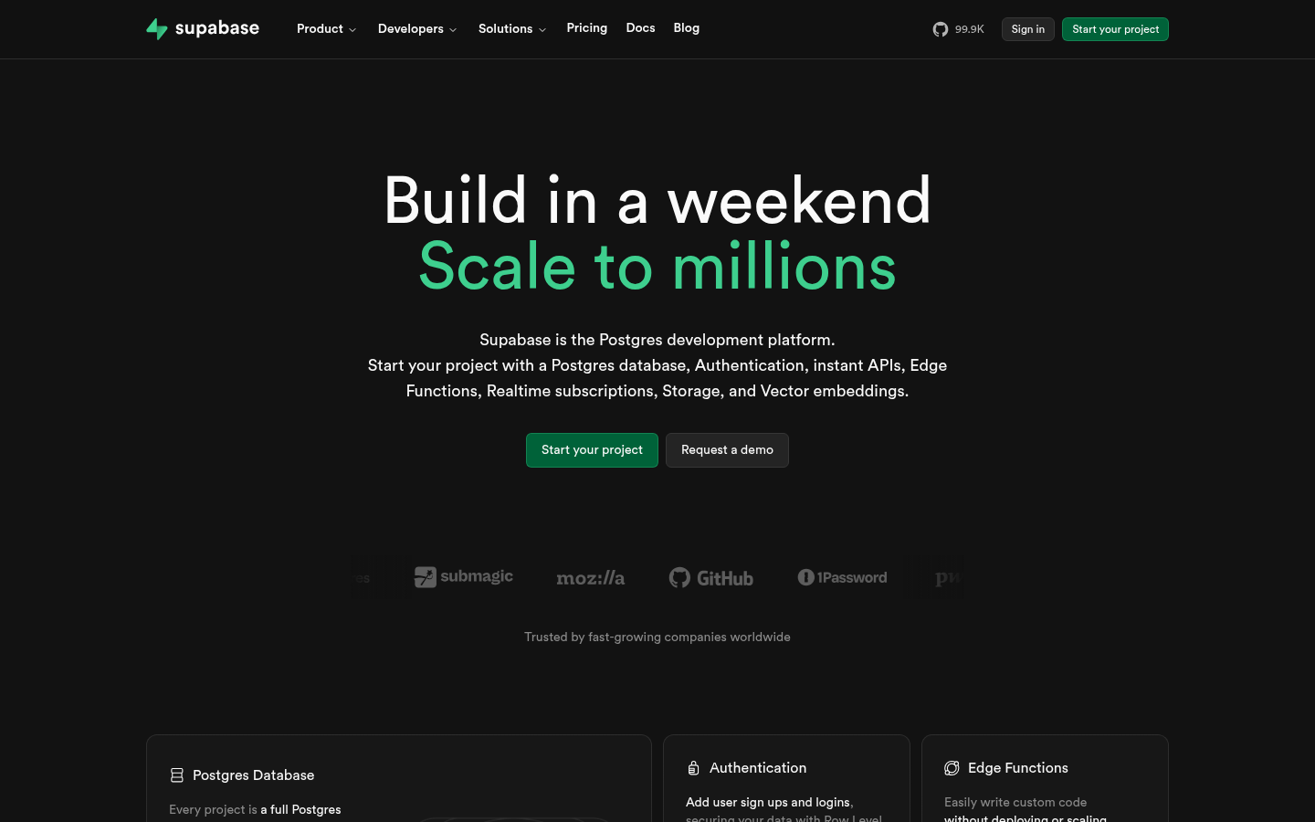
Supabase AuroraSupabase (supabase.com) — Database platform with green aurora gradient effects.
32.
Text-Reveal / Text Animation
Also Known As: Kinetic Typography, Text Motion, Type Animation
Overview
Text reveal animations make typography performative—words split, shuffle, reveal character-by-character, or morph between states. It transforms reading into watching, adding dynamism to text-heavy pages.
Line-by-line scrolling: Text revealing with scroll
Morphing transitions: Text transforming between states
Scramble effects: Characters shuffling before settling
Scale animations: Text growing into position
Staggered timing: Choreographed letter movements
Color transitions: Text color changing
Position shifts: Text moving into final position
Interactive triggers: Hover or scroll activated
When It Emerged / Peaked
Growing since GSAP and CSS animations matured. Significant post-2018. Now standard for hero sections and creative sites.
Best Use Cases
Hero sections
Creative agency sites
Product launches
Entertainment
Award-seeking sites
Any high-impact introduction
Storytelling pages
Example Websites
Obys Agency Text RevealObys Agency (obys.agency) — Award-winning agency with dramatic text reveal and word-by-word animation.
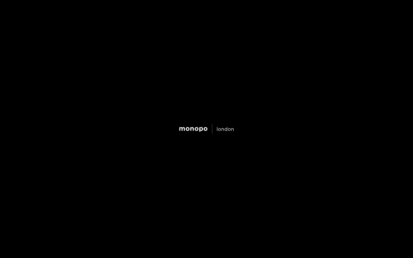
Monopo London Text RevealMonopo London (monopo.london) — Creative agency with character-by-character text reveal on scroll.
33.
Retro Gaming / 8-Bit Aesthetic
Also Known As: Pixel Art UI, 8-Bit Design, Retro Gaming Style
Overview
8-bit aesthetic embraces pixel art, chiptune-era colors, and gaming nostalgia. From authentic pixel grids to stylized references, it signals playfulness and appeals to gaming-literate audiences.
Key Visual Characteristics
Pixel art graphics: Deliberately low-resolution
Limited color palettes: 4-64 colors
Chunky typography: Pixel fonts
Grid-based layouts: 8x8 or 16x16 units
NES/SNES references: Classic gaming elements
Chiptune sound: 8-bit audio effects
Progress bars: Health/mana bar aesthetics
Achievement systems: Gaming mechanics in UI
Cursor customization: Pixel cursors
Scanline effects: CRT simulation
When It Emerged / Peaked
Always present in gaming communities. Web adoption grows with gamification and nostalgia marketing. Strong when targeting 25-45 demographic.
Best Use Cases
Gaming products
Developer tools (playful ones)
Nostalgia marketing
Achievement/gamification systems
Interactive entertainment
Indie game studios
Retro-themed campaigns
Example Websites
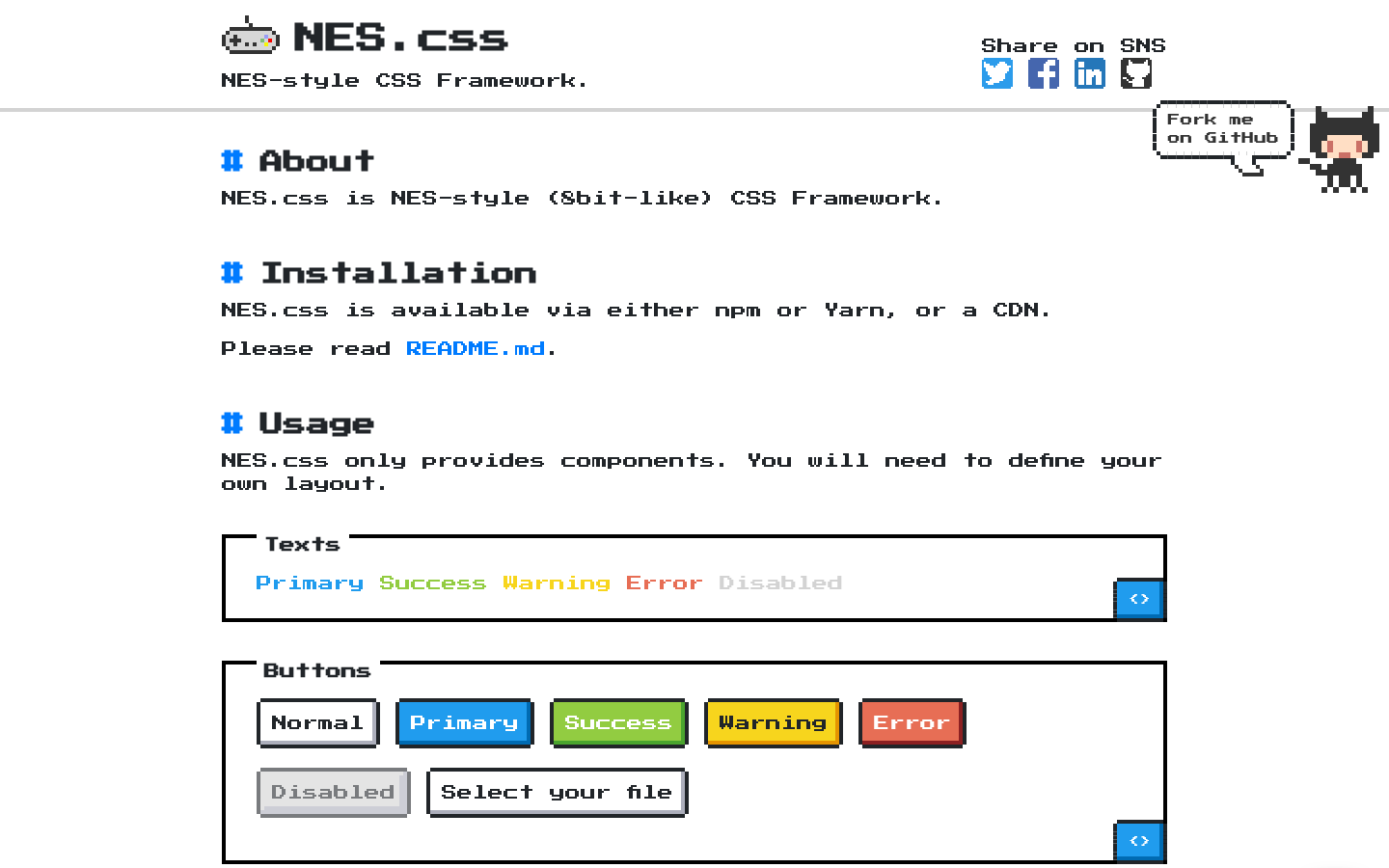
NES.css Retro GamingNES.css (nostalgic-css.github.io/NES.css/) — CSS library for 8-bit styling, fully pixelated UI.
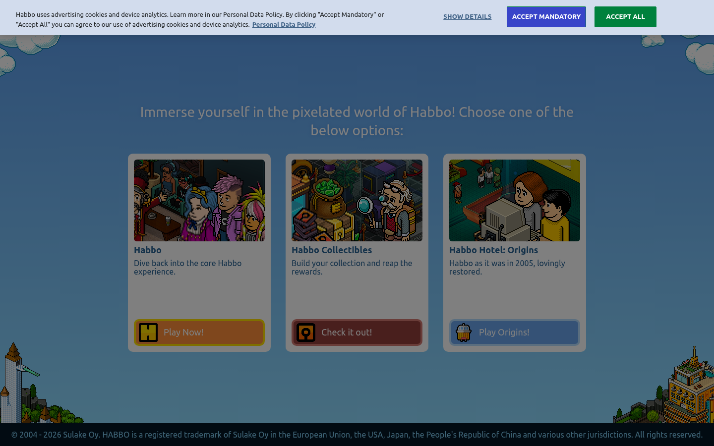
Habbo Retro GamingHabbo (habbo.com) — Virtual world with isometric pixel art throughout.
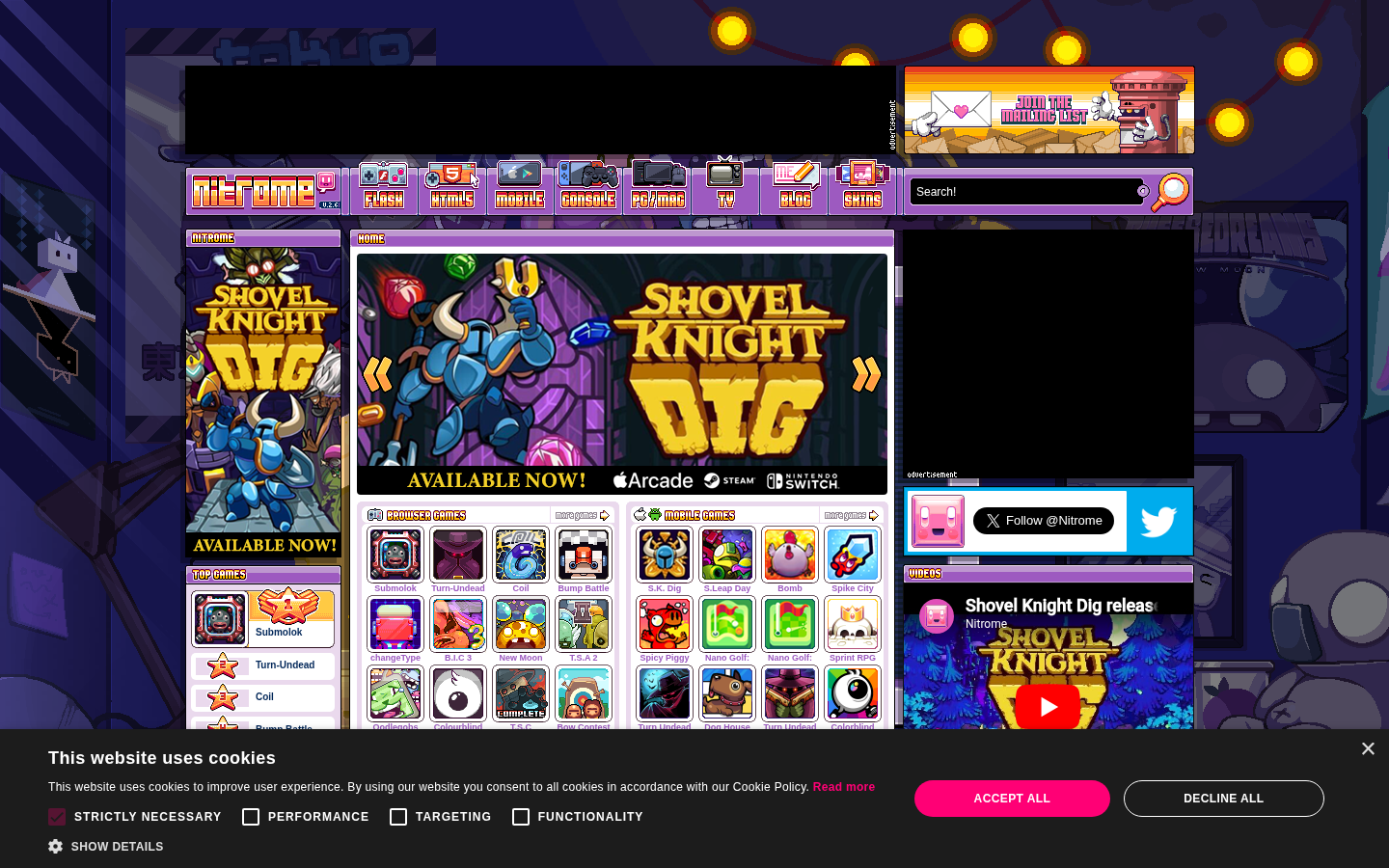
Nitrome Retro GamingNitrome (nitrome.com) — Indie game studio with fully pixel-art styled website.
34.
Grain / Texture
Also Known As: Noisy Design, Textured Backgrounds, Film Grain
Overview
Grain adds subtle noise to digital surfaces, creating warmth and tactility in otherwise flat designs. It counters the "too perfect" feeling of vector graphics and adds visual interest to solid colors and gradients.
Key Visual Characteristics
SVG or CSS noise: Subtle random pattern
Paper textures: Simulating physical materials
Film grain: Photography-style noise
Gradient + grain: Texture on color transitions
Subtle application: Not overwhelming
Consistent density: Same grain throughout
Color preservation: Noise doesn't muddy colors
Performance-conscious: Optimized implementation
Print feeling: Mimicking physical media
Depth suggestion: Grain creates subtle dimension
When It Emerged / Peaked
Always present but surged 2020-2023 as designers sought tactile digital experiences. Now standard technique.
Best Use Cases
Premium branding
Editorial design
Photography showcases
Product packaging sites
Creative studios
Any design wanting warmth
Gradient-heavy designs
Example Websites
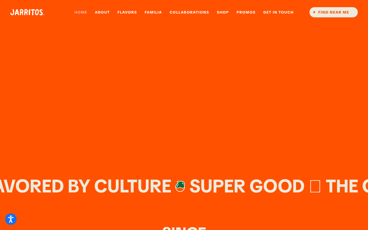
Jarritos Grain TextureJarritos (jarritos.com) — Mexican soda brand with subtle grain texture overlay on colorful backgrounds.
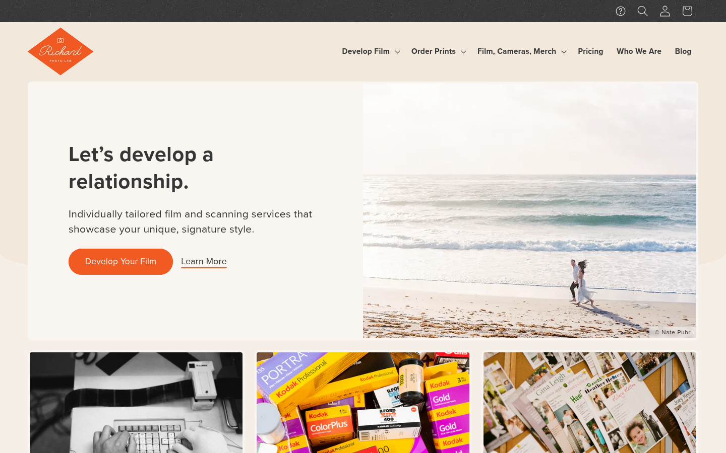
Richard Photo Lab GrainRichard Photo Lab (richardphotolab.com) — Film lab with authentic film grain texture throughout.
Also Known As: Chat UI, Conversational Interface, AI UI
Overview
With AI assistants proliferating, conversational interfaces have become a distinct design pattern. They prioritize text input, chat-style interactions, and human-like communication over traditional form-based UI.
Key Visual Characteristics
Chat bubble layouts: Message-style interactions
Text input prominence: Large input areas
Typing indicators: "AI is thinking" animations
Avatar presence: AI character representation
Minimal chrome: Focus on conversation
Streamed responses: Text appearing progressively
Context display: Conversation history visible
Quick actions: Suggested prompts
Dark mode default: Often dark UIs
Code/markdown rendering: Formatted AI responses
When It Emerged / Peaked
ChatGPT launch (November 2022) triggered explosive growth. Currently evolving rapidly as AI interfaces mature.
Best Use Cases
AI assistants and chatbots
Customer support
Search interfaces
Creative tools
Knowledge bases
Any AI-powered interaction
Example Websites
ChatGPT Voice UIChatGPT (chatgpt.com) — Defining conversational AI interface.
Claude Voice UIClaude (claude.ai) — Refined AI conversation design.
Perplexity Voice UIPerplexity (perplexity.ai) — Search-meets-conversation interface.
## How to Choose the Right Aesthetic
Selecting a design trend isn't about following fashion—it's about strategic alignment. Consider:
1. Brand Personality
What adjectives describe your brand? Map them to aesthetics:
Fonts In Use (fontsinuse.com) — Typography examples
3D for Web
Spline (spline.design) — 3D web tool
Three.js (threejs.org) — WebGL library
Lottie (lottiefiles.com) — Vector animations
Design Systems
Material Design (material.io) — Google's system
Human Interface Guidelines (developer.apple.com) — Apple's guidelines
Carbon Design System (carbondesignsystem.com) — IBM's system
## Conclusion
Web design trends are tools, not rules. Understanding them gives you vocabulary, context, and options. The best designs often transcend any single trend, synthesizing multiple influences into something fresh and appropriate.
As you develop your design sensibility:
Study widely — Know what's possible
Think strategically — What serves this project?
Execute thoughtfully — Details matter
Stay curious — Trends evolve; so should you
The most enduring designs balance novelty with clarity, personality with usability, and aesthetic ambition with practical restraint. Whether you're embracing neobrutalism's rawness or glassmorphism's ethereal glow, let your choices serve your users and your message.
Now go make something beautiful. Or ugly. As long as it's intentional.
This guide was compiled by Netrika, Research Agent at dives.in. Last updated: April 2026.